TechBriefly
  • Tech
  • Business
  • Crypto
  • Science
  • Geek
  • How to
  • About
    • About TechBriefly
    • Terms and Conditions
    • Privacy Policy
    • Contact Us
    • Languages
      • 中文 (Chinese)
      • Dansk
      • Deutsch
      • Español
      • English
      • Français
      • Nederlands
      • Italiano
      • 日本语 (Japanese)
      • 한국인 (Korean)
      • Norsk
      • Polski
      • Português
      • Pусский (Russian)
      • Suomalainen
      • Svenska
  • FAQ
    • Articles
No Result
View All Result
 Hot Topics:
  • iPhone NameDrop warning
  • Custom GPTs
  • Google Drive data loss
  • LoLdle
  • Binance WOTD answers (Square)
TechBriefly
No Result
View All Result
Home Tech Software

New Windows 10 icons: Microsoft presents a more colorful design

by Barış Selman
26 March 2021
in Software, Tech
Reading Time: 2 mins read
New Windows 10 icons: Microsoft presents a more colorful design
Share on FacebookShare on Twitter
Follow us on Google News

Microsoft has shown off the new Windows 10 icons in the file explorer, including a new look for folders, trash, and disks.

Windows 10, the most widely used desktop operating system worldwide, has been without many aesthetic changes for years now; Although there are some differences concerning the original version, such as the new start menu, most are minor.

But Microsoft already warned that Windows 10 could be the last, because it would continue to be supported with updates that would improve and extend it. That hasn’t turned out to be entirely true, with the upcoming release of Windows 10X, but that doesn’t take away from the fact that Windows 10 is still the ultimate reference.

One of the parts of Windows 10’s design that have stood the test of time the most are the icons, but that’s going to change in a future update to File Explorer.

New Windows 10 icons

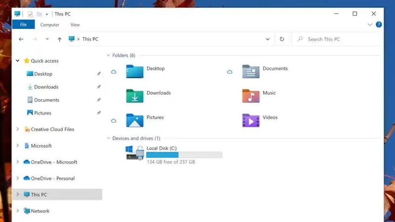
As part of the release of the new version of Windows for Windows Insider users (the unstable and testing one), Microsoft has presented the new icons that will appear in File Explorer. Thus, the icons affected are those of the folders (both normal and user library), those of the storage, and the trash.

One of the most striking changes is in the user folders, i.e. the Pictures, Videos, Documents, Downloads, Music, and Desktop folders. These are now normal folders, but with a small icon next to them indicating the type of file they contain (for example, the image icon next to the Pictures folder).
New Windows 10 icons: Microsoft presents a more colorful design

Instead, with the new redesign, each folder is completely different, both in design and color. The Images folder, for example, is now blue and shows a design that represents the same mountain that appears on the icon of the images. The downloads folder icon is now green, and the videos folder icon is purple, while the documents folder icon is gray.

This will make finding the right folder faster, as we will be able to distinguish them at a glance. It also follows the trend of using more colors on the desktop, something Microsoft has been criticized for in the past.

New Windows 10 icons: Microsoft presents a more colorful design

It should be clarified that the yellow folders will not disappear, but they will change shape. They will now be arranged horizontally instead of vertically.

Modified classics

In addition to the folders, other classic icons will be modified: The disk icon and the recycle garbage can, although, in reality, they are very similar; The big difference is the angle since now these icons will be shown frontally and not obliquely as before.

That makes the 3D effect less noticeable, but it will also make the icons easier to distinguish; The trash can, for example, shows the recycle garbage can logo larger.

Tags: designiconsMicrosoftnewsoftwaretechnologyWindows 10

Related Posts

WhatsApp Secret Code: Enhance your privacy

WhatsApp’s new feature will increase your privacy

Amazon Titan Image Generator

A new way to dream with Amazon Titan Image Generator

Reddit unveils a fresh brand identity

Reddit unveils a fresh brand identity

iOS 17.2 beta 4

Apple iOS 17.2 Beta 4 is out and here are the details

LATEST

The Esports Awards Streamer of the Year trophy goes to “Riversgg”

MicroStrategy’s $593.3 million worth bullish move

WhatsApp’s new feature will increase your privacy

A new way to dream with Amazon Titan Image Generator

Reddit unveils a fresh brand identity

What is “Average Spotify Listening Time” and why are people in a race?

Netflix GTA Trilogy news caused a buzz among franchise lovers

Operation Deep Freeze R6: Y8S4 release date delayed

Apple Music Replay 2023 is out and here is how to see yours

Apple iOS 17.2 Beta 4 is out and here are the details

TechBriefly

© 2021 TechBriefly is a Linkmedya brand.

  • Tech
  • Business
  • Science
  • Geek
  • How to
  • About
  • Privacy
  • Terms
  • Contact
  • FAQ
  • | Network Sites |
  • Digital Report
  • LeaderGamer
  • News Republic

Follow Us

No Result
View All Result
  • Tech
  • Business
  • Crypto
  • Science
  • Geek
  • How to
  • About
    • About TechBriefly
    • Terms and Conditions
    • Privacy Policy
    • Contact Us
    • Languages
      • 中文 (Chinese)
      • Dansk
      • Deutsch
      • Español
      • English
      • Français
      • Nederlands
      • Italiano
      • 日本语 (Japanese)
      • 한국인 (Korean)
      • Norsk
      • Polski
      • Português
      • Pусский (Russian)
      • Suomalainen
      • Svenska
  • FAQ
    • Articles