Google continues to redesign its applications. After launching the new interface of the Play Store last April, now it seems that it is the turn of Google Weather and Gboard.
Google seems to be gradually implementing, or in the testing phase, new designs for its weather app and keyboard, as the new interface is not yet available to everyone. They have only been activated for a small number of users.
Google Weather

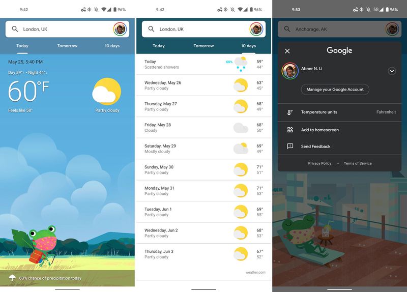
Since Google Weather arrived more than five years ago, the weather application that comes hidden in our phones has not changed its interface, so it continues with the most initial design of Material Design.
Now Google has begun to activate a small redesign for Weather, in which they replace the side hamburger menu with the new search bar that integrates our profile. By clicking on our profile we will have access to its menu with the options to change the temperature units, add a shortcut to the desktop or manage our Google account.
Gboard

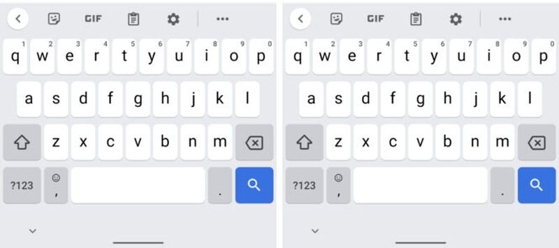
In the case of Gboard, we see how Google continues testing another new interface for its keyboard. This time they are applying the rounded design of Material You, the new interface of Android 12.
This means that we have the new Google Sans font that replaces Roboto, with slightly larger letters, and that the “?123” and “Enter/Search” buttons are now rounded. The bar will also appear rounded if we show the keyboard with its bordered layout.
This new keyboard interface is appearing to users with Android 11 and Android 12, and the layout appears to not be exclusive to the Pixel, as users with a OnePlus report receiving the new layout.


