With both WWDC 2022 and Google I/O over, let’s take a look at the new versions of the OSs and how they compare in our iOS 16 vs Android 13 comparison.
It’s that time of year again when we see what new features are coming to our phones in the future. No, we’re not referring to the fall’s newest smartphones; rather, we’re referring to the OS on your phone. As a result, both Google and Apple hold a developer conference each summer to discuss new software upgrades and introduce the next version of their mobile operating system. Today, we will be sharing with you our iOS 16 vs Android 13 comparison.
Apple iOS 16 features
Before we dive into the iOS 16 vs Android 13 comparison, let us talk about the features that will be added to both of the OSs with this next big release.
iOS 16 release date
Apple released the next version of its mobile operating system, iOS 16, which will be available for iPhone 8 and above in September. Similarly, earlier this year in March, Google announced Android 13, the next version of Android, an operating system that runs on most non-Apple smartphones. Android 13 and iOS 16 give your gadget convenience, as well as new features and changes.
iOS 16 Lock Screen features
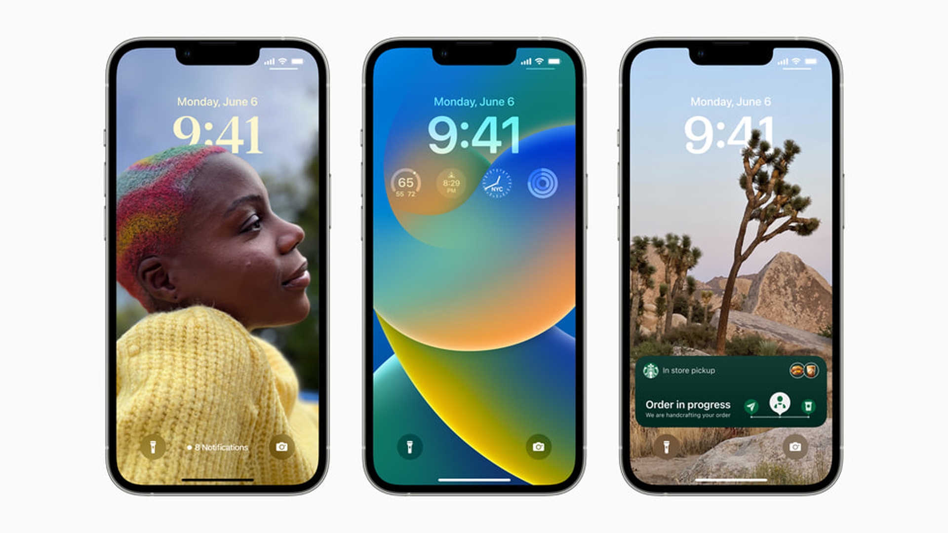
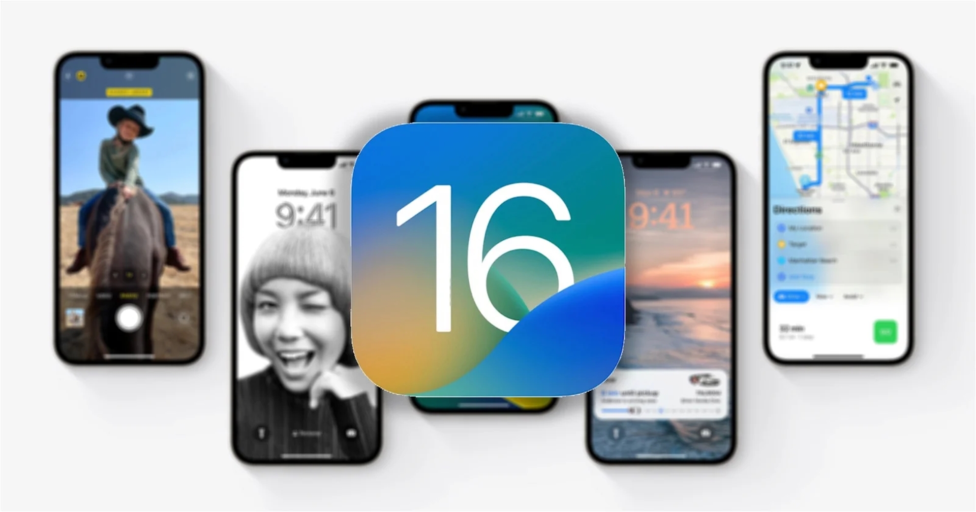
In iOS 16, Apple rebuilt how your lock screen looks, allowing you to customize it completely. Live Text is now available in videos, allowing you to extract text from a video. Apple wants to replace your passwords with a passkey in iOS 16. Furthermore, on iOS 16, you can type fluently using your iPhone hands-free thanks to new and improved dictation.
iOS 16 Unsend button
An option to edit or unsend a message in Messages has been added with iOS 16. The iPhone can now make contactless payments thanks to Apple iOS 16. Sharing photographs with your family and friends will also be considerably easier. There’s also a brand-new wallpaper gallery full of dozens of new wallpapers available. The SharePlay feature will work in the Message app as well. You can check out these new features after you download the beta version.
Android 13 features
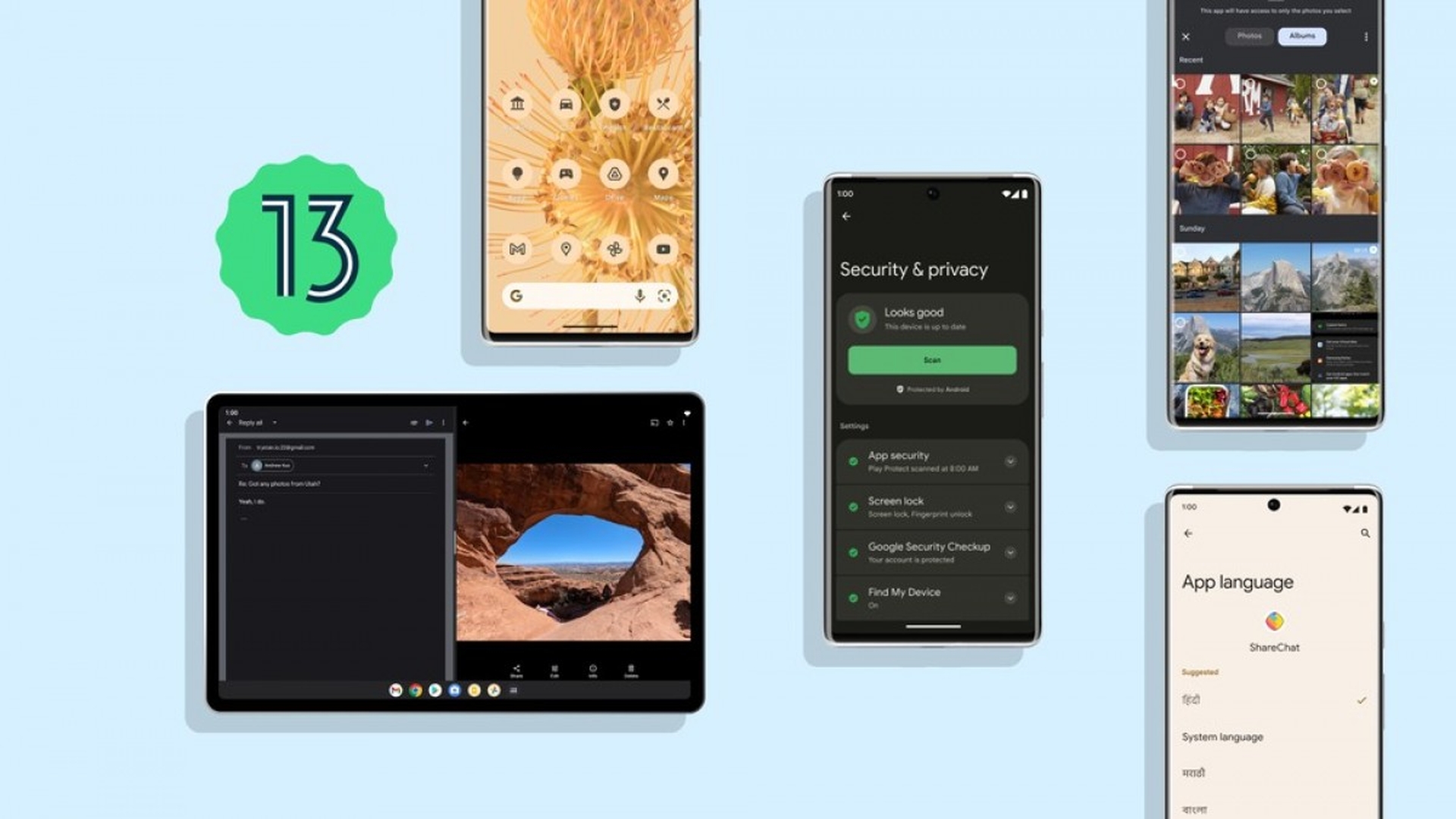
Meanwhile, Android 13 focuses more on usefulness since Android 12 was a huge change in terms of design. However, there have been some visual changes as third-party software icons will now follow the new style language. Google also introduced several new features to its messaging program, which now includes photos and videos. Without requiring access to mobile internet, you will be able to send messages over Wi-Fi.
There are now typing indicators, and group conversations will be entirely encrypted in the future. And, like iOS, apps on Android will need your permission to notify you. There’s also a new security software for checking your privacy and security settings, as well as several other additions and improvements.
They are quite similar yet distinct. Some elements have been around on Android for a long time, but they will be introduced to iOS now. There are features in iOS that Android does not have. So, let’s take a closer look at what’s better about iOS 16 and where it differs from Android. If you want to check the OS yourself, make sure to check out our guide on how to install Android 13.
iOS 16 vs Android 13
Now that we have gone over some of the new features of both OSs, it is time for our iOS 16 vs Android 13 comparison. Apple’s iOS has never been known for being user-customizable. Until recently, you could only swap the wallpaper, but Apple subsequently introduced widgets, which have become an important element of our daily lives. Android had widgets long before Apple added its iteration. However, Google also modified the widgets in Android 12.
Now, fast-forward to 2022, and Apple has completely redesigned the lock screen. You may customize the appearance and add widgets to learn even more information without unlocking your iPhone. Notifications also roll in from the bottom now, making them easier to find than on Android. Android has “At a glance,” rather than widgets, which is also effective. But Android needs to organize notifications properly.
It’s a misconception to claim that iOS has better looks or that Android is more beautiful because it is a personal choice. Some individuals adore iOS for its simplicity, while others despise it because it lacks customization options like Android and a theming engine. So, it’s up to you to choose whether you want a clean design or something more interesting.
Android launches Apple Wallet alternative
In certain nations, Apple Wallet or Google Pay is not very popular. However, they are becoming increasingly important in most areas where consumers may store their payment cards, travel cards, health records, or identification documents.
After years of failure with Google Pay, the company resurrected “Google Wallet” as “Google Pay” last month. Now that it’s catching up to Apple Wallet in order to provide those features on Android. Also, the Messages app has gotten better on both Android and iOS, but RCS is not being adopted by Apple any time soon.
With Android 13, Google refreshed its RCS, the next messaging standard. You’ll now be able to see a typing indicator, and you may form groups. Users will also be able to send high-resolution photos on Android 13. The chats will be end-to-end encrypted. These aren’t particularly innovative features; most of them have been available on Apple’s Messages app for some time.
Meanwhile, Apple, which has yet to join the RCS movement, has added several new features to its Messages app. Users can change a message for up to 15 minutes in iOS 16. You may also retract a message for up to 30 days after deleting it. Furthermore, SharePlay will be introduced to the Messages app in iOS 16; you’ll be able to text and listen to the same song or watch a video at once while messaging with your friend about it.
It’s fantastic to see iOS and Android get new messaging capabilities that enhance how we can interact, and maybe cut down on our reliance on WhatsApp. But hopefully one day, Apple will hop onto the RCS bandwagon and eliminate this divide between users of the different platforms.
How do they compare in privacy features?
In an ideal world, all major technology firms would be working to safeguard your privacy and security on the internet. Apple was one of those ideal tech companies, but Google and Android have also made a good effort.
Apple added the App Tracking Transparency in iOS 14, which allows users to remove an app’s tracking capabilities. If your camera or microphone is being used, a camera and microphone icon will appear on the upper right corner of the screen. Apple has now introduced Safety Check as a feature that enables you to restrict access to data so that it is not abused by apps that you have downloaded.
Meanwhile, Android does have privacy indicators, despite the fact that it lacks the App Tracking Transparency. According to Google’s recent I/O keynote, Android 13 will allow users greater control over data sharing with third-party apps. Users will also be able to grant applications permission to specific photographs in 13 instead of giving them access to the whole library. As a result, Android is catching up with iOS when it comes to privacy features.
iOS 16 vs Android 13 conclusion
To many, neither iOS 16 nor Android 13 may appear to have any major improvements. However, both OSs include changes that promise to revolutionize how you use your phones. These include some basic functions that may give you that little bit of extra value in your life. While who comes on top in iOS 16 vs Android 13 solely depends on one’s personal preferences, new versions of both have made great improvements to the overall useability and features.
We hope that our iOS 16 vs Android 13 comparison has been useful to you. You might also like to check out iPadOS 16’s major theme is collaboration among users, or how to make an app a widget on Android and iPhone.

