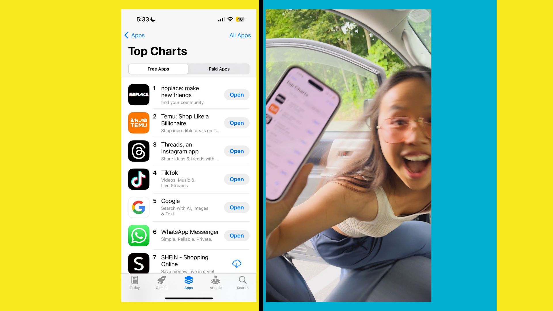
The noplace app has surged to the top of the App Store, capturing the attention of Gen Z and anyone nostalgic for the customizable profiles of Myspace combined with the instant updates of Twitter.
As a modern-day Myspace, noplace allows users to personalize their profiles with colorful themes and share updates about their lives in a way that fosters connection and community.
The app’s meteoric rise to the number one spot highlights its appeal and the desire for a more social social media experience.
What makes noplace app so special?
noplace app brings back the fun and customization of Myspace, allowing users to express their personalities through their profiles. The app’s founder, Tiffany Zhong, recognized the gap in the market for a platform that combines the personal touch of Myspace with the fast-paced updates of Twitter. Zhong’s experience in the social media landscape gave her the insight needed to create a platform that appeals to today’s youth, who crave authenticity and connection.
alert alert !!!
prepare to yap and design your profile on noplace in less than a week!!!⏳
pre order RIGHT NOW
or else… pic.twitter.com/NwDzbnwgvC
— noplace app (@thenoplace) June 29, 2024
The customizable profiles on noplace app are reminiscent of Myspace, with users able to choose colors, add tags representing their interests, and share current activities. This level of personalization allows users to create a digital space that truly reflects who they are. For Gen Z, who may not have experienced Myspace firsthand, this offers a novel way to engage with social media.
How noplace app risen to the top of App Store?
Before its official launch, noplace app had already gone viral thanks to its invite-only beta phase. Early adopters, including K-pop fans, spread the word about the app, creating a buzz that led to its rapid rise in popularity on the App Store. The app’s unique features, such as the ability to share live updates and customizable profiles, struck a chord with users looking for a more engaging social media experience.
noplace’s founder, Tiffany Zhong, used her extensive knowledge of consumer apps to design a platform that resonates with younger users. Her past success in identifying breakout apps like Musical.ly (now TikTok) demonstrates her keen understanding of what makes a social media platform successful. This expertise, combined with the app’s innovative features, helped noplace app gain traction quickly.

The app’s success is also attributed to its focus on text-based updates, setting it apart from platforms dominated by photos and videos. The emphasis on real-time, text-based interactions fosters a sense of immediacy and connection, which is appealing to users who want to share their current experiences with friends and followers.
The originality we missed
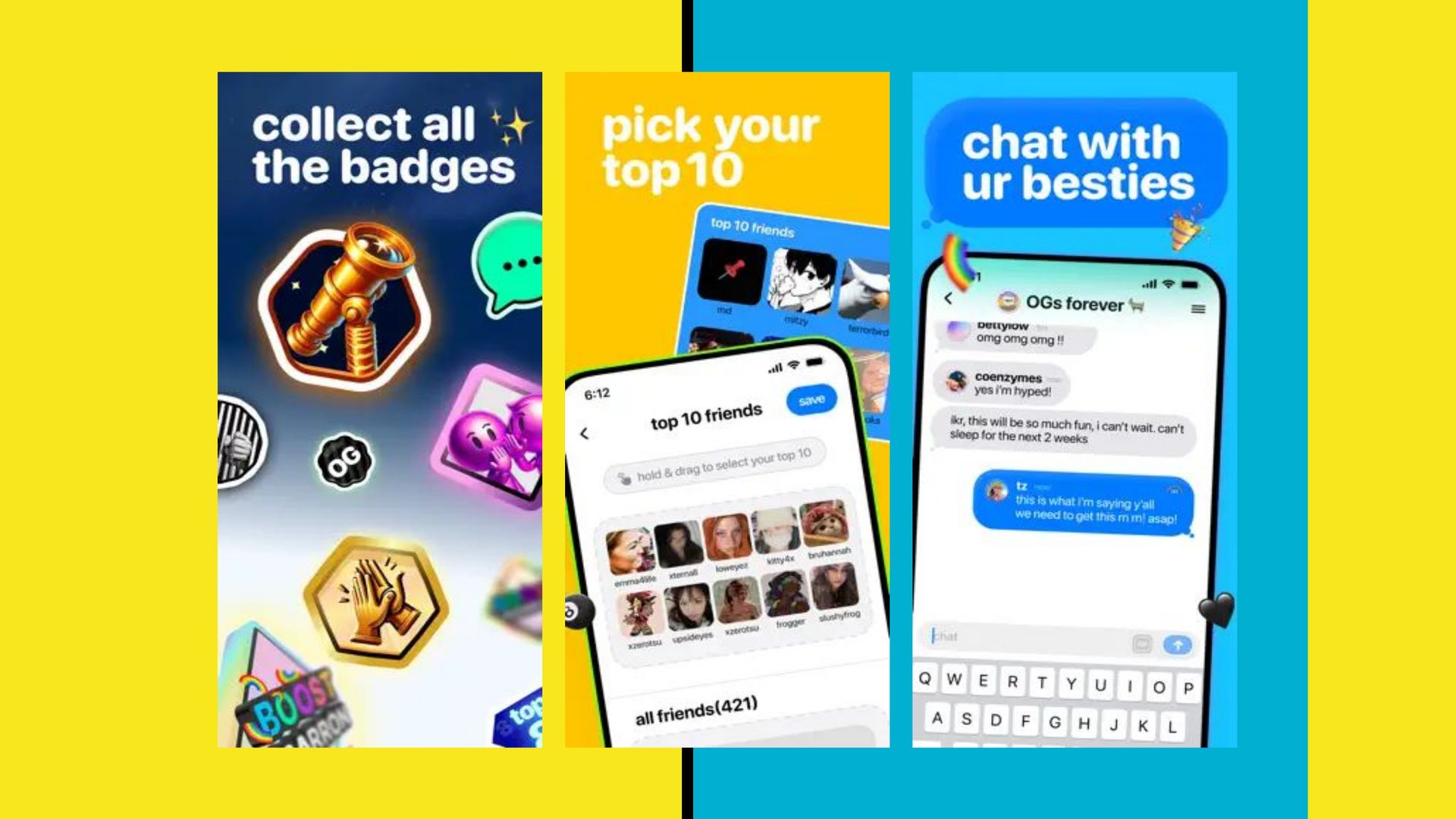
Noplace distinguishes itself with a range of features designed to enhance user engagement and personalization. At its core, the app offers customizable profiles where users can share what they are currently doing, listening to, or watching. These profiles can be decorated with tags, or “stars,” representing various interests, making it easier for users to find others with similar hobbies and passions.
The app includes a “top 10 friends” section, a nostalgic nod to Myspace’s “top 8” feature, allowing users to highlight their closest connections. This creates a sense of community and prioritizes relationships, a core aspect of the app’s design. By focusing on what users are doing in the moment, rather than past highlights, noplace encourages genuine interactions and real-time updates.
Another standout feature is the app’s dual feeds:
- One for friends
- One for a global audience
Feeds are accessible to all users. Both feeds are presented in reverse chronological order, ensuring that the most recent updates are always at the top. This straightforward approach contrasts with the algorithm-driven feeds of other social media platforms, offering a more transparent and immediate way to stay connected.

Meet the noplace app team
noplace was developed by a remotely distributed team of seven full-time employees, led by Tiffany Zhong. The team focused on creating a platform that combines the best aspects of past social media giants with innovative new features. Their efforts paid off, as the app quickly gained a following and rose to the top of the App Store rankings.
The app uses AI technology to enhance user experience without relying on traditional algorithms. Instead of curating feeds, the AI provides summaries of missed updates and helps users discover new content based on their interests.
Moderation is a key focus for noplace, especially for younger users. The app has built-in safeguards to create a safer environment for those under 18, including a moderated feed. The company’s commitment to user safety is evident in its development of an internal dashboard for monitoring and managing content, demonstrating a proactive approach to maintaining a positive user experience.
Rising to the top and beyond!
noplace app’s rapid ascent to the top of the App Store is a testament to its unique blend of personalization, real-time updates, and community-focused features. As it continues to grow, the app aims to attract even more users looking for an alternative to traditional social media platforms. With a strong foundation and a clear vision, noplace is poised to make a lasting impact on the social media landscape.
The noplace app is currently available as a free download on iOS, with a read-only mode accessible on the web. While monetization plans have not yet been implemented, the app’s popularity and user engagement suggest a promising future. Backed by investors including 776 (Alexis Ohanian) and Forerunner Ventures, noplace has the financial support and strategic guidance needed to continue its upward trajectory.
Featured image credit: noplace app


