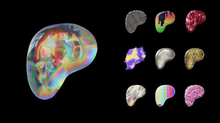
The platform that is arguably the most deeply ingrained in the creator community has unveiled the new Patreon Logo, alongside a comprehensive brand transformation. This encompassing update includes a revamped wordmark and a contemporary approach to color, photography, and typography.
If there’s one thing that the transformation of its logo and the overall rebranding showcase, it’s Patreon’s effort to stay pertinent and in step with its birthplace, the internet.
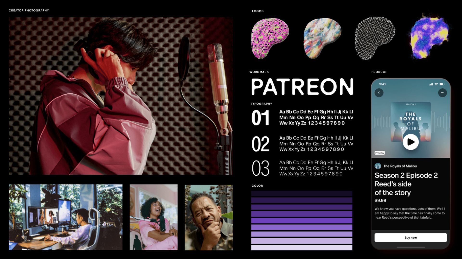
The new Patreon logo embraces the digital realm
In a bold departure from traditional branding norms, Patreon’s new look fully embraces its digital origins. It thrives in the fluidity and adaptability of the online world. This means animations, interactivity, and context-sensitive shifts offer an engaging experience tailored to a diverse range of creators.
The brand has shed the constraints of a fixed form, giving way to a dynamic visual identity that resonates with the ever-evolving digital landscape.
The living logo
At the heart of this transformation lies the new Patreon logo, now a dynamic entity in constant motion. Its abstracted 3-D “P” shape, fluid textures, and adaptable colors vividly embody the boundless energy of artistic expression.

Even in static settings, the logo maintains its vitality, with different iterations crafted for varied applications. This living logo encapsulates the spirit of creation, capturing the essence of each individual artist it represents.
Typography and wordmark
Typography and wordmark have been meticulously crafted with creators in mind. By leveraging variable digital typefaces, the new Patreon logo adapts seamlessly to different contexts, ensuring creators remain the focal point. The typography system is versatile, harmonizing effortlessly with any creator’s unique aesthetic.
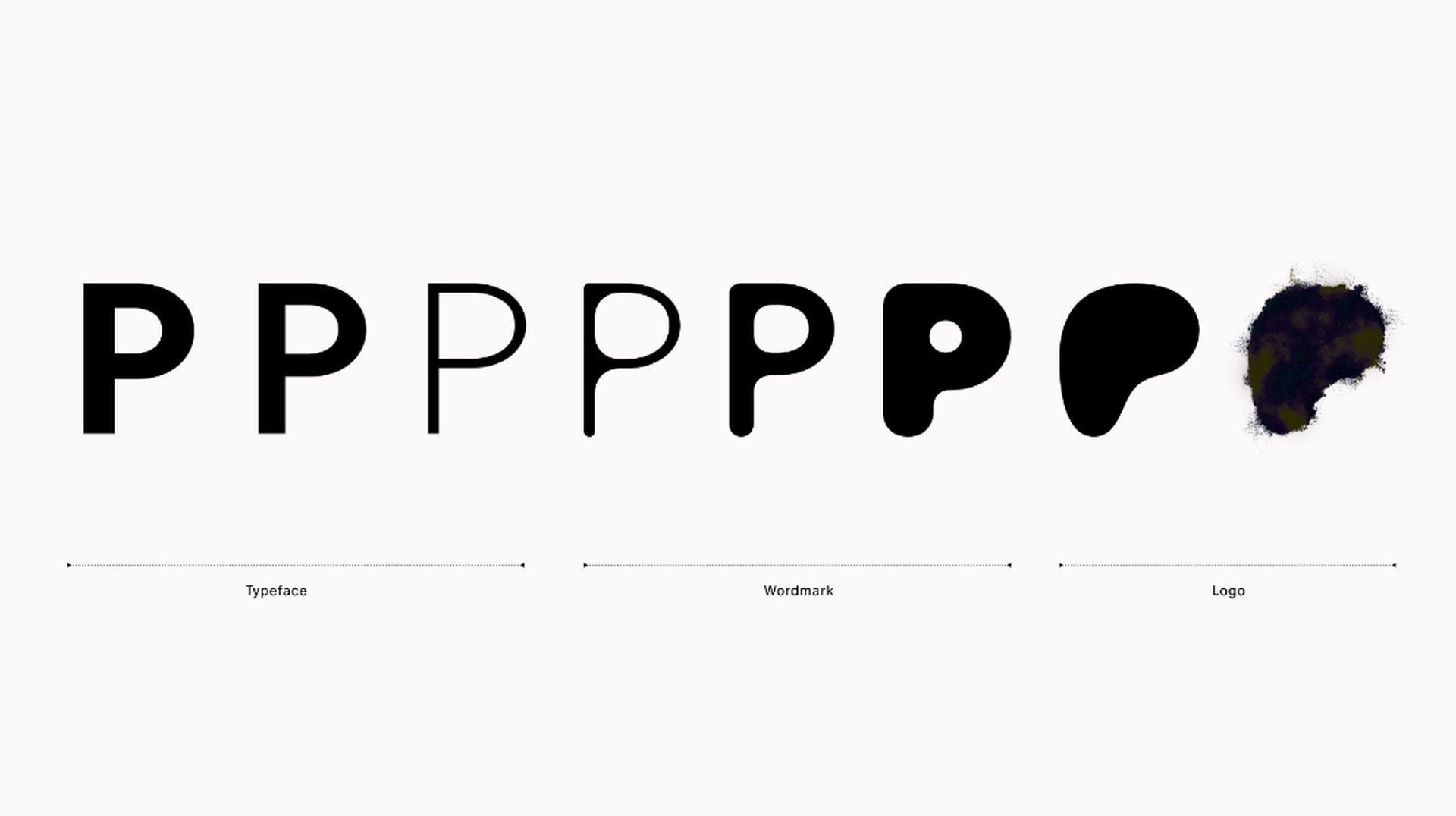
This intentional design choice empowers creators to not only use the platform but to be a fundamental part of its visual identity.
Color harmony
Departing from the rigidity of a single brand color, Patreon embraces a palette of gradients. This allows for a seamless integration with a wide range of creators’ styles, providing room for greater personalization and authenticity.
The color scheme isn’t just a visual choice; it’s a reflection of the brand’s commitment to celebrating diversity and individuality within the creator community.
Capturing creativity
Photography takes center stage in this new brand identity. Each photoshoot is a unique opportunity to encapsulate the essence of a creator’s journey. Photographers are handpicked not only for their technical expertise but for their ability to resonate with the creators they photograph, ensuring an authentic portrayal.
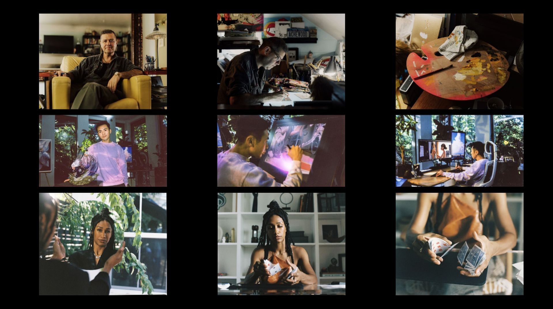
These images serve as a window into the creative process, immortalizing the dedication and passion behind each piece of work.
Empowering creators
Patreon’s vision is rooted in granting creators ownership over their work and businesses. The brand is designed to be co-owned by creators, a visual representation of their collective impact. An upcoming logo creation tool will empower them to infuse their own colors, textures, and motion.
Additionally, creators can leverage Patreon’s color language to personalize their digital space, making it an extension of their artistic identity.
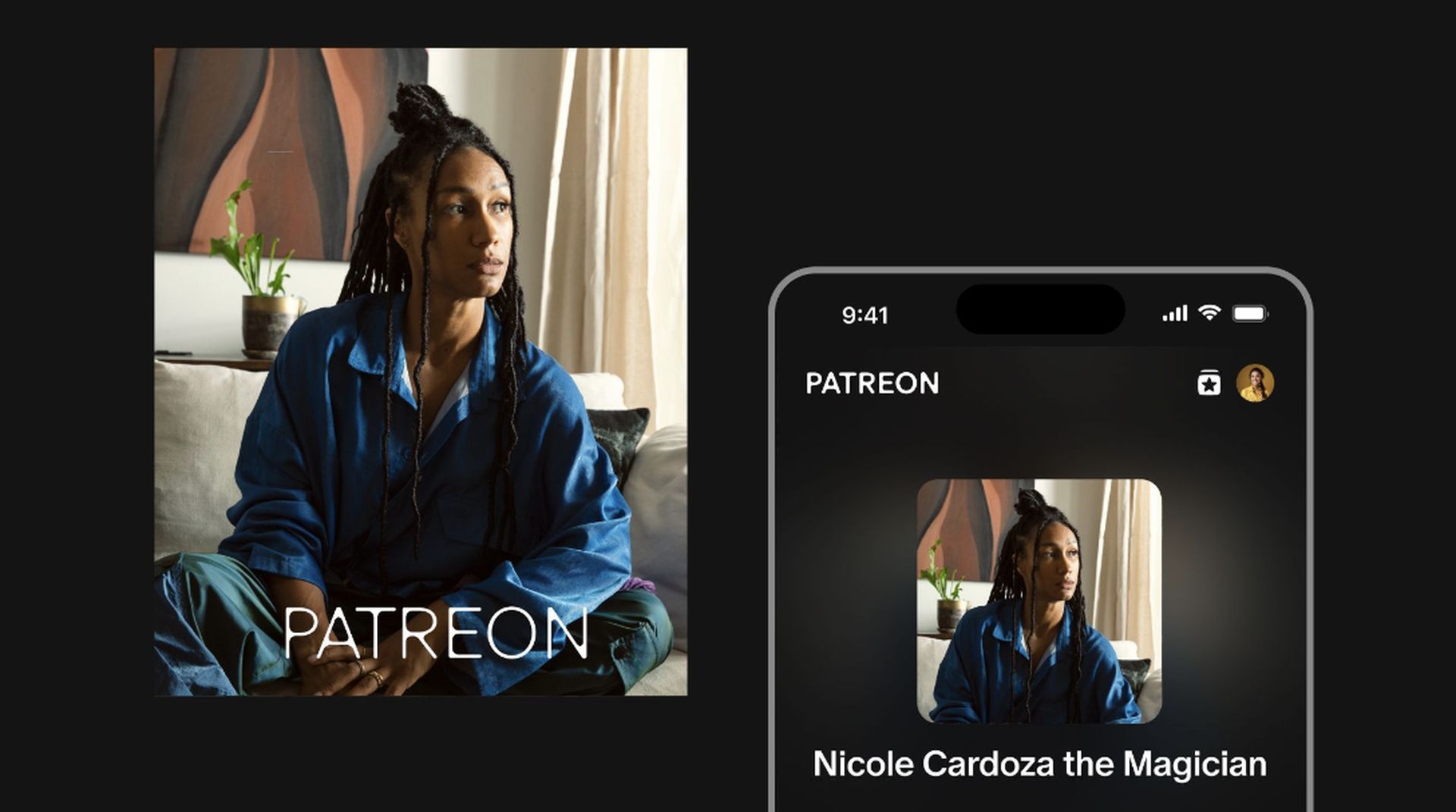
The new brand isn’t just a visual update; it’s a celebration of user creativity in all its forms. It stands as a testament to a future where creators are not only supported but empowered. In this space, communities flourish, and boundaries are non-existent. The possibilities for expression are limitless, and we’re eager to witness the myriad ways creators will bring this brand to life. This evolution isn’t just about Patreon; it’s about every individual who contributes to this vibrant tapestry of creativity.
Meanwhile, if you’re eager to showcase your content on the internet, may it be on Patreon or anywhere else, make sure to check out our article on all you need to know about getting started as a content creator.
Featured image credit: Patreon

