That Apple closes and opens its online store is not surprising at all, in fact, it does it at least once for each event in which it is going to present new products. So much so that lately not so much anymore, but there was a time when the closed store with the message “We’ll be back soon” was the sign that many were looking for to confirm that, indeed, there was going to be a launch during the event.
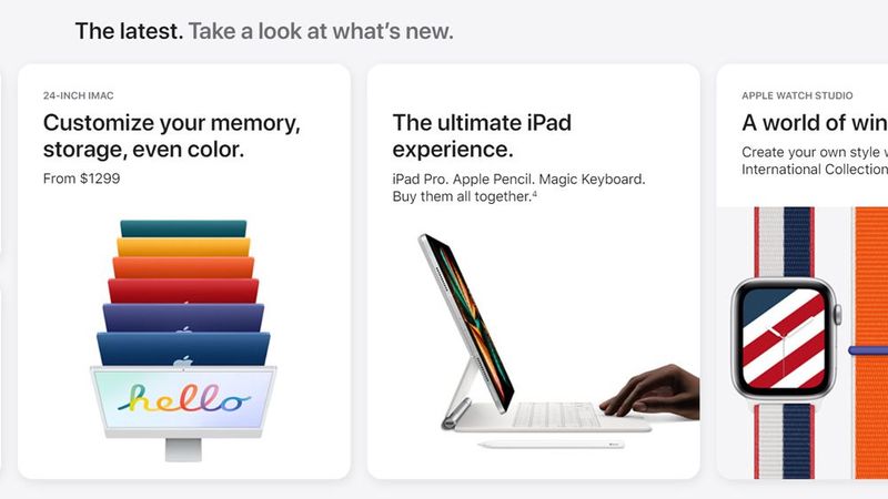
What is more striking, and has happened in the last few hours, is that Apple completely redesigned its online store, that is, the one accessible through its website, and even more so that, at last, they have made it more accessible with a new menu entry. Let’s take a look at these changes and, with that, try to find out if they are telling us something.
First of all, as you’ve probably already guessed if you’ve seen it, the new store seems specially designed to be visited from touch devices. The subdivision into horizontal blocks with scroll is the clearest sign of this since this type of navigation is much more comfortable using a touch screen than with a mouse. And given Apple’s emphasis on usability and interface design, this leads us to believe that many web sales must be made from touchscreen devices.

It strikes me, however, given that as of today Apple does not have touchscreen computers. This is something that part of the community has been asking for years for MacBooks and iMacs, but so far the only response from Apple has been the Touch Bar on the MacBook Pro. I wonder if this means that they are considering some change in this regard, or that the volume of purchases that occurs from the web version in accesses from their computers is not so significant that they have taken it into account during the redesign.
Another striking aspect is the order of the products. One would expect to find on the left, in the most prominent position, the iPhone, right? Well no, the first thing we see are the Macs. With the jump from Intel to Apple Silicon, Cupertino seems to have stepped on the gas when it comes to their computers, and this positioning seems to highlight that point. Next, we find iPhone, iPad, Apple Watch, AirPods, AirTag, Apple TV, HomePod Mini, and finally accessories.


