In March Google Play started testing a redesign that did away with the hamburger menu and completely changed how the My Apps section worked. Later, the redesign was coming to everyone and it looked like My Apps wouldn’t change, but now the My Apps redesign is starting to roll out as well.
At the moment Google hasn’t made this change official, so it’s not clear if it’s still a test or will eventually come to everyone. The redesign means that the five tabs in My apps are merged into two, having to do one more tap to go to the list of apps with updates. It also has its advantages, though.

If you’ve gotten used to how the My apps section of Google Play works, it’s about time you start preparing for the possibility of it changing completely. What started as a minority test along with the removal of the ☰ menu and the change in settings, is being rolled out to users.
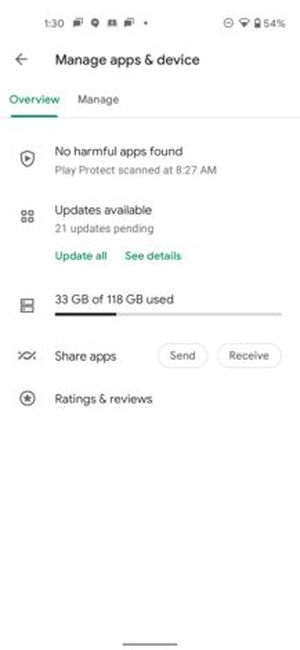
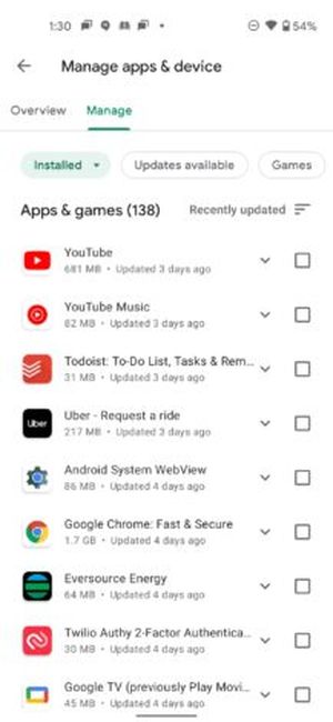
This is a radical change to the My Apps menu, which, disappears as such. In its place, you find yourself with Manage apps and devices, a centralized place where you can do the same as before, but in a different way. Instead of there being five tabs, there are two.

The summary includes Play Protect at the top, just like before, but for updates, there is a master button that updates everything. You can still see which apps have updates, but it involves one more tap, you have to go into View details.
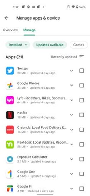
View details take you right to Pending Downloads, which is the closest thing to the previous My Apps, though without anything additional. Here the functionality is the same, either tap on the apps you want to update by hand or tap Update all.
Other sections found in the Summary are the mobile space usage (previously available in the Installed tab). Tapping on the graph opens Free up space, where you can choose apps to download. This has not changed from the previous version and remains one of the few ways to uninstall multiple applications at once on an Android mobile without root.

App sharing with Nearby and access to your ratings and reviews are also integrated. Sharing apps was previously in a tab of its own, while the reviews were inside Installed.
The Manage tab is quite interesting, especially as it is set up for batch actions and having filters. For example, you can use the Available Updates filter and select which applications you want to update and which ones you don’t want to update. This was not possible with the previous design unless you clicked Install manually on all the apps you wanted to update.
The most interesting new feature is perhaps that you can finally remove many apps from your collection in one fell swoop, using the “Not installed” filter and the Remove button. All the apps you download from Google Play are added to your collection, and over time the list can include thousands of apps.
What about the My Apps shortcut? If you were using this shortcut to go straight to pending updates, it still works, but it takes you to the Summary tab. That is, if you want to see the apps with updates, you have to make an additional tap.


