Spotify has launched a new update for its desktop application and web player that renews the design of the library. The new face of the app also includes new features with the aim of improving the listening experience and facilitating access to preferred content. This revamped interface comes after months of testing according to the company.
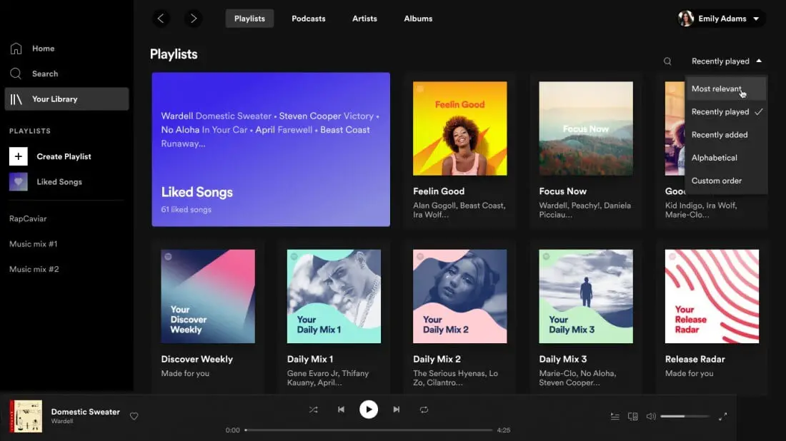
Surely the first thing that strikes us about the new design is the search engine scrolling. The new design has placed it on the left side of the navigation page in which, in addition, incorporates prominently the artists and favorite songs of each user.

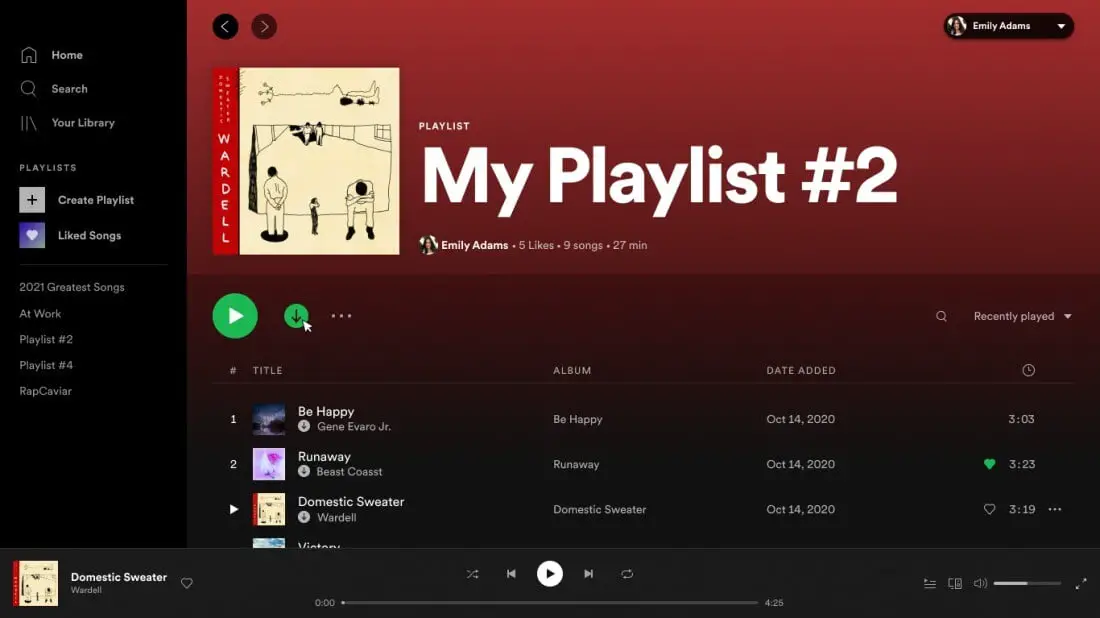
The playlists also receive new features with this update. Changes that aim to make it easier to create playlists and have more control over them. When it comes to shaping them, with this revamp we will be able to change descriptions, upload images, order existing songs in those already created, and add new content through a new search bar that has been embedded. In general, existing options in much the same way, although improved.
It is also important to note that in the desktop application users will be able to edit the playback queue and see the songs that have been recently listened to, in addition to being able to sort their library with a new drop-down menu located in the upper right corner.

Another big new feature aims to save premium users some bandwidth with offline mode. Subscribers, according to Spotify, will be able to download both music and podcasts to be played offline by simply pressing the download button on the desktop app itself. A feature that most mobile users will be grateful to see back because the streaming platform already had it, although it was withdrawn.
Last but not least, Spotify includes new keyboard shortcuts for command lovers. We can see them in the desktop application, on PC, by pressing Control + ?, and on macOS with Command + ?.
The new design and the new features will be available from today and you can try them out really soon.


