Microsoft is preparing changes in Windows 10 beyond the operating system’s functions.
It wants the news displayed in the taskbar to be relevant to the user. And of course, that they have a presentation design that is pleasant and easy to use.
Microsoft’s new design for news in Windows 10
Recall that Microsoft announced earlier this year that it was bringing a weather and news widget to the Windows 10 taskbar. The idea is that it becomes a mini information center for the user, without having to open the web browser.

And now it wants to go a step further to improve the user experience. One of the aspects on which the Microsoft team is focusing is to give a facelift to the way news is presented in Windows 10. It wants the new design to be attractive, encourage the user to consult this section, and interact with the information.
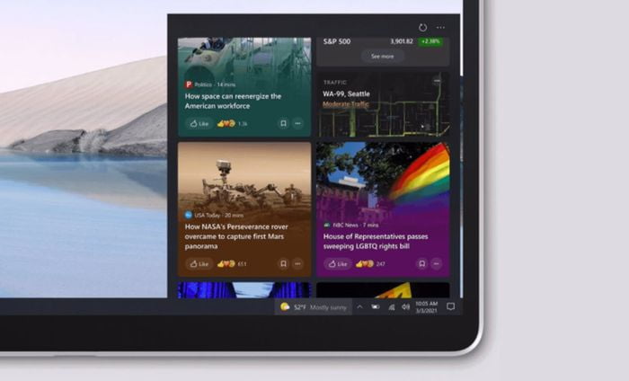
To this end, it is developing a new design and a series of functions, as can already be seen in one of the latest versions of the Insiders program. As you can see in the image above, they have paid attention to different details.
For example, they have focused on highlighting more headlines and adding more vivid colors to the news cards to draw users’ attention, as well as more information to provide context. And the experience Microsoft wants to provide goes beyond the taskbar, so when the user chooses “See more news” the design line will continue in the web browser view.
This shiny card dynamic will also be reflected in Microsoft Edge. And of course, options will be included for the user to leave a reaction, like, save the article or choose to share it on social networks.


