POCO returned last year to the markets worldwide with several models, such as the F2 Pro, its high-end. 2020 was an important year for the brand, because in January last year it confirmed its independence from Xiaomi, after having been born as a secondary brand. Now they seek to reaffirm this independence by releasing a new logo and mascot.
POCO has now officially announced its new logo and mascot, in a further step to distance itself from Xiaomi and show that they are an independent brand. A bold and striking logo, with a curious mascot, which the brand itself wanted to explain in this announcement.
POCO launches new logo and mascot
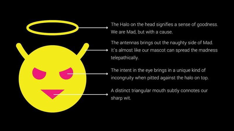
The new POCO logo changes the first o of its name for the new mascot, a kind of devil with a halo. It keeps a font similar to the one the brand was already using until now, but we can see that they introduce the logo in new color combinations, so it is much more striking.

The brand has also presented its mascot, following in the footsteps of others such as Realme, which previously did the same. This mascot comes with the Made of Mad concept, with which the manufacturer refers to a confused emotion in the consumer’s mind, and represents how each individual looks for the best alternatives to the most popular or common ones. Also, they have explained the various elements that make up this mascot:
- The halo represents a sense of goodness. From POCO they claim to be crazy, but it’s for a cause.
- The antennae show the rebellious and/or mischievous side of the mascot. It’s as if the mascot can expand the madness telepathically.
- The eyes offer a contrast to the halo that is introduced at the top of this mascot.
- The triangular mouth references the brand’s sharp wit.
This new POCO logo and mascot mark the beginning of a new era for the manufacturer, which thus seeks to further distance itself from Xiaomi. Now we just have to wait for them to present new phones, something for which we will certainly not have to wait too long.


