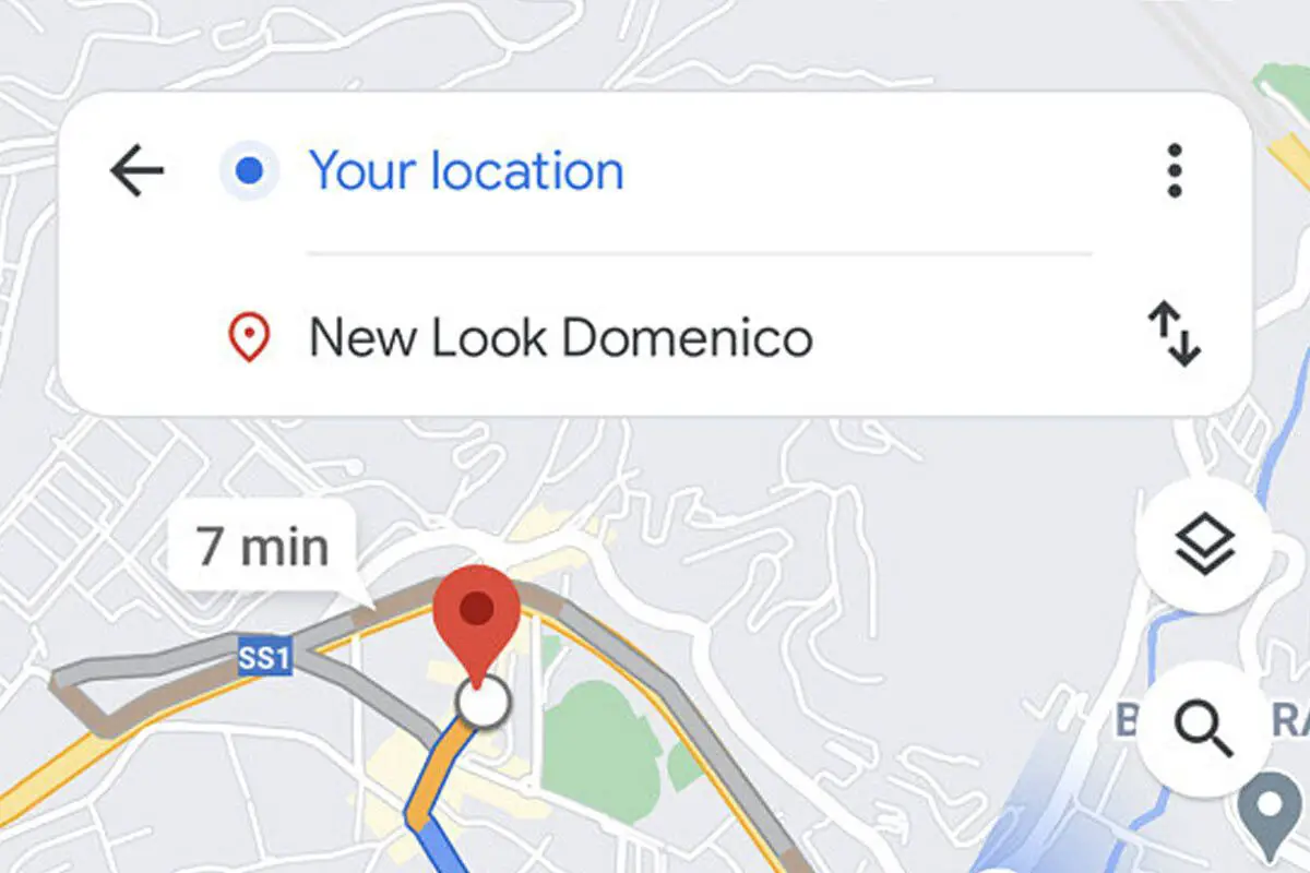
Google Maps tests a new minimalist design for routes. Google usually tests its applications with different functions or designs. Some of these pass the test and others fall by the wayside. The latest, spotted by XDA is a redesign of the interface before starting a route.
Google Maps tests a new minimalist design for routes
It is not a radical change, although it makes the map more immersive, showing the fields to enter the origin and destination floating on the map, instead of in the top bar, as it was present until now.
Google Maps has received quite a few redesigns. The last one coincided with its 15th birthday, although apart from major changes, other small tweaks are common. The latest one is subtle, although it really gives a quite different look to the interface that appears before starting a route.

Instead of showing the route locations in a top bar, as it has been for many years, this test leaves the background map in full screen and keeps the start and destination floating over the map, as you can see in the following example image:
The redesign gives a somewhat cleaner look, although at the cost of the disappearance of tabs and buttons present in the previous design, which showed a summary of how long each type of transport took. The information is still available, of course, but in the form of a vertical strip, at the bottom of the window.
In a way, it is consistent with the design where the next exit you should take during a route is displayed, and that changed in 2019 also for a similar floating menu. It would make sense, therefore, for this change to go ahead, although with testing you never know.


