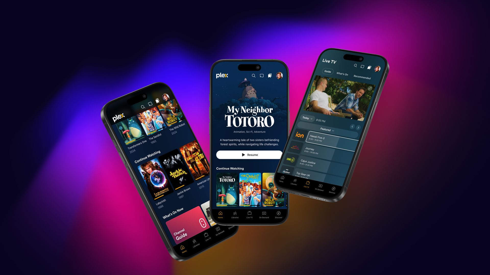
The new Plex app has integration features to improve user experience as the company pivots toward a streaming service. The updates highlight seamless navigation, personalization, and improved content discovery. This transition aligns with its strategy to boost revenue through ad-supported content. The redesign has been in development for nearly two years and is critical for Plex, especially following a $40 million fundraising round earlier in 2024, propelling it closer to profitability by early 2025.
Plex’s newly reimagined experience will first be available on mobile platforms, with plans to roll out to television interfaces soon. Users will notice a departure from traditional hamburger menus, replaced with a tabbed navigation bar at the bottom of the screen. This new layout directs users to their libraries, live TV channels, on-demand streams, and a dedicated discovery section. The app’s interface also prominently features the Watchlist—where users track shows and movies they intend to view—placing it at the top for easy access.
Early preview of the redesigned Plex app is wowing users
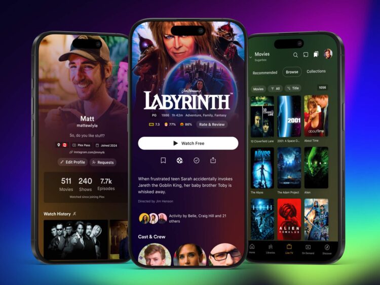
The redesign aims to streamline access to personal media libraries alongside newfound streaming capabilities. Users who continue using Plex for home media management will find a dedicated button centralizing this access and several customization options that allow them to favor their libraries as needed. Additionally, interface changes include reorganized personal details such as profiles, watch histories, and a list of subscribed streaming services.
As part of the update, visual elements have received a significant boost. On a few key detail pages within Plex—movie and show detail pages, for example—Plex will prominently display rich artwork, responding to feedback that indicates an appetite for richer experiences via visual engagement. Each user’s personal Plex profile will also feature these enhancements, enriching the viewing experience.

Plex asserts that this redesign goes beyond cosmetic changes, citing a complete rewrite of apps to create a unified codebase. This streamlined approach facilitates quicker updates and new features across all supported platforms. Consequently, the development team anticipates releasing new features more rapidly once the migration is complete.
The mobile redesign is in an early-access preview phase, allowing users to test the interface while Plex gathers valuable feedback before a broader deployment. Certain features like playlists, casting, and other enhancements are absent during this preview. Plex plans to address these gaps and keep the existing app available for users during this transitional period to prevent issues similar to the Sonos app controversy. Weekly updates throughout the preview will ensure that users remain engaged and informed about forthcoming enhancements.
Images credit: Plex


