Making your iPhone homescreen a little more customized has always been a lot of fun. People have been creative with their icons for a while now, but with iOS 18, they’re adding a simple but striking way to tint your app icons. With this feature, you can easily change the color of your icons with just a few clicks; you can make the shift subtle, or you can make it bold. You don’t need complex methods since iOS 18 is built with everything right in.
What’s the most important thing to know? You can set it so that your app icons have any shade you’d like—even change them on the fly. You can also vary how dark or light you want them to be with a few simple taps. We’ll go through how you, too, can do this effortlessly.
How to change the color of your app icons in iOS 18
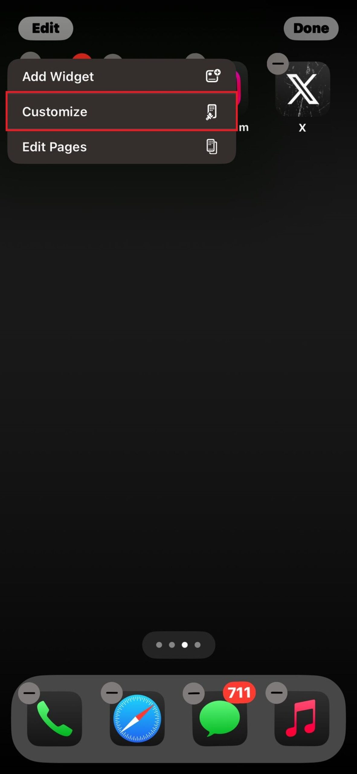
First, let’s get ready to see your icons dance. You’ll want to long-press any space on your homescreen to jiggle up your app icons. Once you see this, look at the top-left corner of your screen, and you’ll notice an “Edit” button. Tap that, and then select the option to “Customize.”
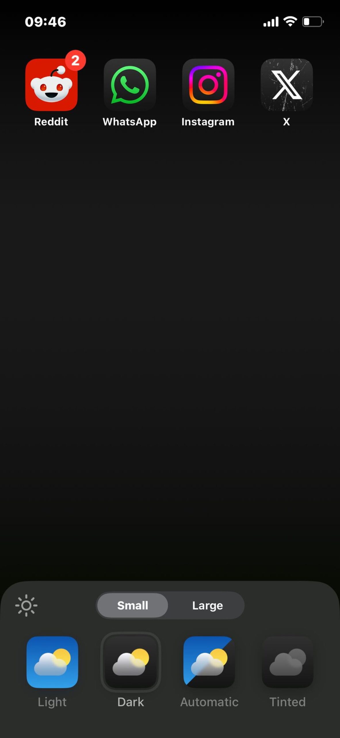
From here, you will be shown some options at the bottom of your screen. That is where the fun truly starts.

Explore your options: Light, dark, automatic, or tinted
Once you’ve opened the customization menu, you’ll see several options:
- Light or Dark: These choices allow you to keep your app icons consistent using Light or Dark mode.
- Automatic: If you’d rather not decide, iOS will choose when to darken or lighten your icons based on your current mode.
- Tinted: This is where you can start playing with color.
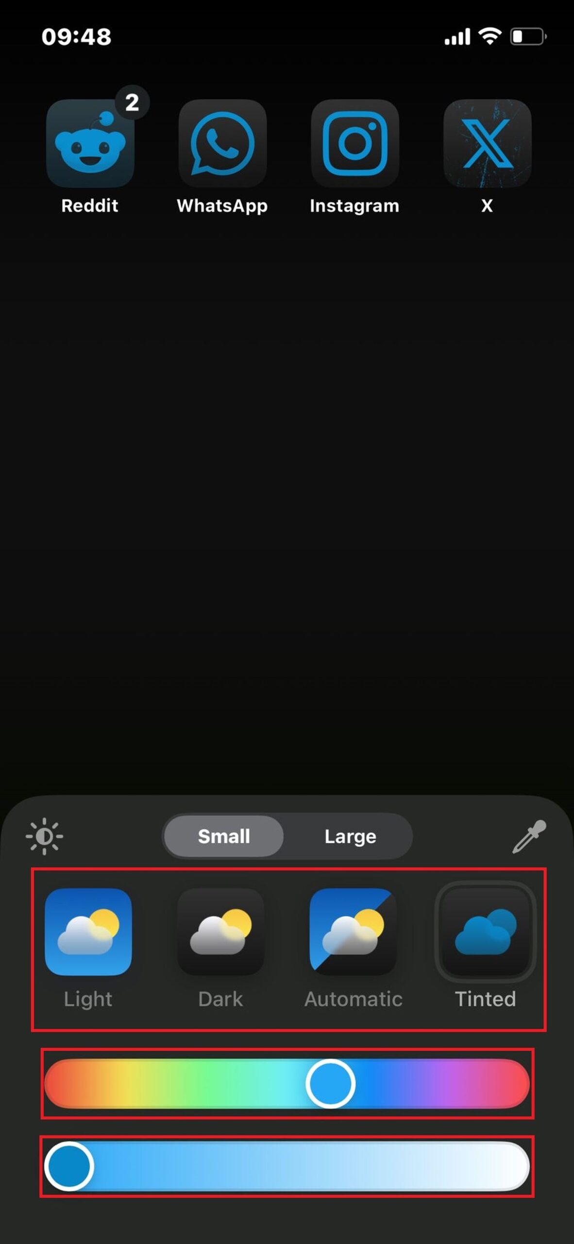
When you select the “Tinted” option, the magic happens. This is the same, but two sliders appear to select a color on one side and adjust how light or dark this color will be on the other. When moving the top slider to green, if you want your icons to come with a green time at the top or white icons, I mean. Next, the bottom slider lets you change the color of that green and see the result happening in real-time.

How to return to the original look
As picky as you’re feeling about your tint color, you can even further down the line and match your icons to the spot color of your wallpaper. To begin this, tap the icon above the class in the top right of the popup menu. You will get the screen to change, and you can drag a small circle over your wallpaper. Once you’ve discovered your color match, lift your finger, and the tint will stick to the icons in your app.

This dropper feature is perfect for a smooth transition between your wallpaper and app icons. Think you’re tired of your new icon tint? Don’t worry—returning to the default look is just as easy. Return to the same customization menu and choose either “Light,” “Dark,” or “Automatic,” and your icons will return to their original state, leaving you with the classic app colors you’re familiar with.
Tinting your app icons can easily freshen up the look of your iPhone, and in a very matter-of-fact way—without getting too complicated and resorting to creating your icons from scratch. However, with iOS 18, homescreen personalization is faster and more possible.
Image credits: Apple


