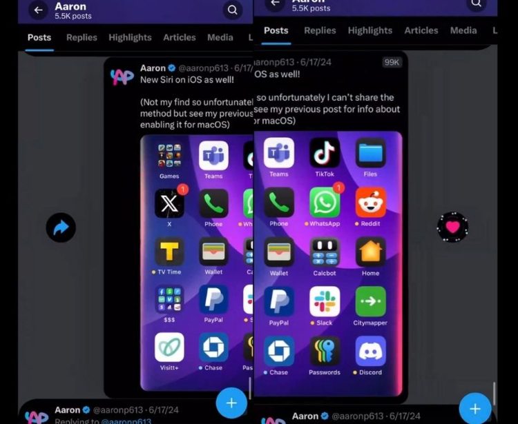
X is set to undergo a significant redesign affecting how users interact with posts. The latest redesign idea removes like, repost (retweet), and reply buttons from individual posts on users’ timelines. Instead of tapping buttons, users will swipe left or right to like or reply. iOS users can also force touch to access these options.
Additionally, metrics such as likes and retweets won’t be visible anymore. Only the view count, now placed in the upper right corner of posts, will remain visible.
View counts are shown in the top right corner pic.twitter.com/tNlVgnpLpk
— Aaron (@aaronp613) July 2, 2024
Why the change?
Musk aims to streamline the user experience and shift focus away from metrics that often drive superficial interactions. By making likes private earlier and now removing these buttons, Musk wants to encourage more meaningful engagement. He believes this will lead to more thoughtful interactions and less emphasis on popularity-driven metrics.
Mixed reactions
The redesign has sparked mixed reactions. Critics worry about transparency and usability without visible buttons, especially for content creators who rely on engagement metrics. Supporters see it as a bold move towards improving user experience and fostering genuine interactions.
What’s next?
The success of this redesign will depend on how users adapt and whether it achieves Musk’s goal of enhancing user satisfaction. As with previous changes, Musk is likely to adjust based on user feedback to refine the platform’s new direction.
Yeah
— Elon Musk (@elonmusk) July 3, 2024
In summary, Elon Musk’s redesign of X marks a significant shift in social media interaction, aiming to simplify and deepen user engagement while challenging traditional metrics-driven norms.
Featured image credit: Aaron/X


