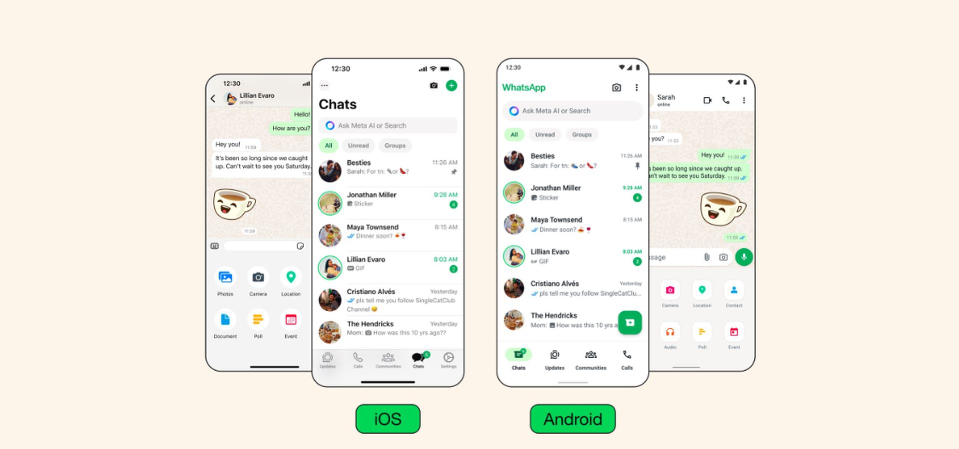
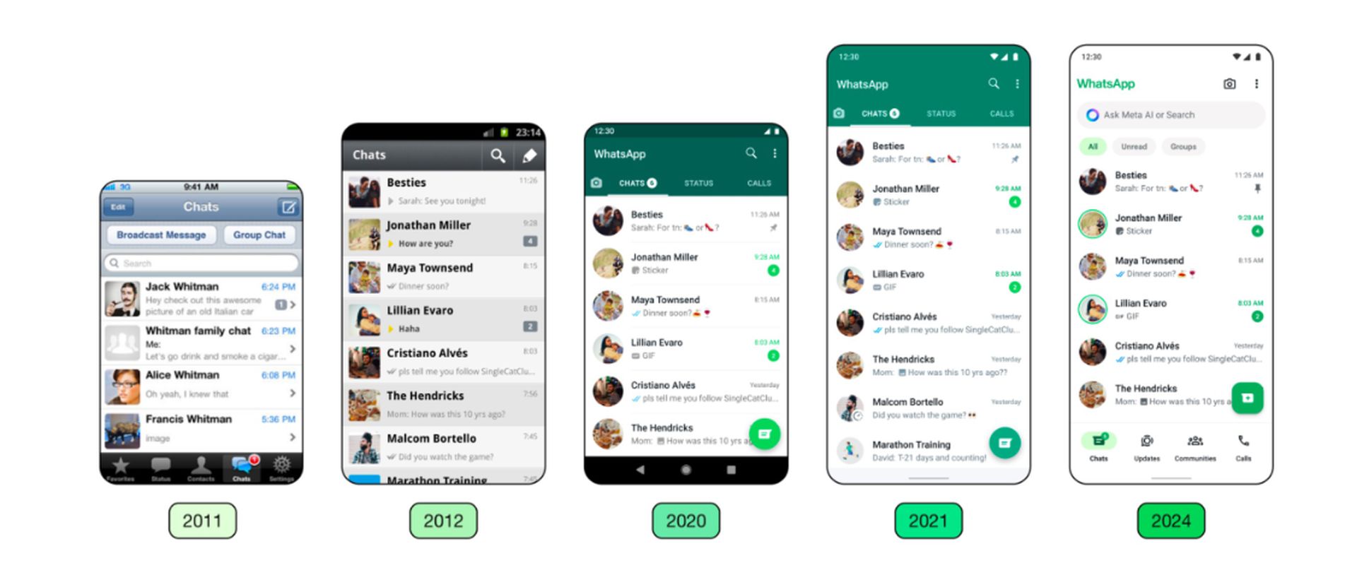
WhatsApp has finally released a long-awaited update for iOS and Android users, attracting attention with its new design. This update makes the user experience smoother and more visually appealing.
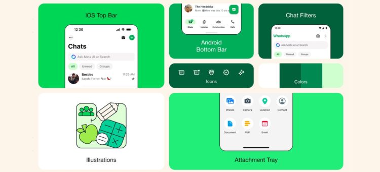
The new design adopts green tones as an accent color, making WhatsApp‘s unique identity even more distinctive. Green is more prominent in elements such as notification badges and buttons, creating a pleasing effect among users.
However, the improvement of dark mode is also quite noticeable. Dark mode now helps reduce eye strain in low-light environments with higher contrast and darker tones. Also, icons and illustrations have a more rounded and contoured style, making the visual experience more appealing.
WhatsApp has changed its iOS and Android UI
This update once again demonstrates WhatsApp’s commitment to meeting users’ expectations. With its user-friendly interface and ever-improving features, WhatsApp is strengthening its position as an important player in the world of communication.

On the other hand, WhatsApp’s statement is as follows:
At WhatsApp, our work shapes the way more than 2 billion people worldwide communicate every day. We take this role seriously, and we focus on the details to get it right for our users. We aim to create an app that not only works seamlessly, but also feels like a natural extension of your phone — allowing you to focus on the conversations that matter in your daily life. We believe success is achieved when our design enhances how people communicate on WhatsApp and empowers them to connect in new ways.
Our design philosophy builds on our product principles of keeping WhatsApp simple, reliable and private. We filter these through a design lens to build intuitive and clear flows that work universally and help people connect, while protecting their privacy. We pay close attention to how people use their devices and design our user interface to complement their existing experience, so WhatsApp feels familiar and easy to navigate. If you know how to use your device, using WhatsApp should be easy.
I think the new interface is a good change; the design is more modern and usable, and the bottom navigation bar makes it easier to access.
However, I also understand that some users find it difficult to get used to the old design, and it is natural that they need time to get used to the new design.

Personally, I really like this redesign. The use of green tones and improved dark mode give the app a more modern and user-friendly look. With the update, I once again appreciate WhatsApp’s commitment to meeting its users’ expectations.
Featured image credit: WaBetaInfo


