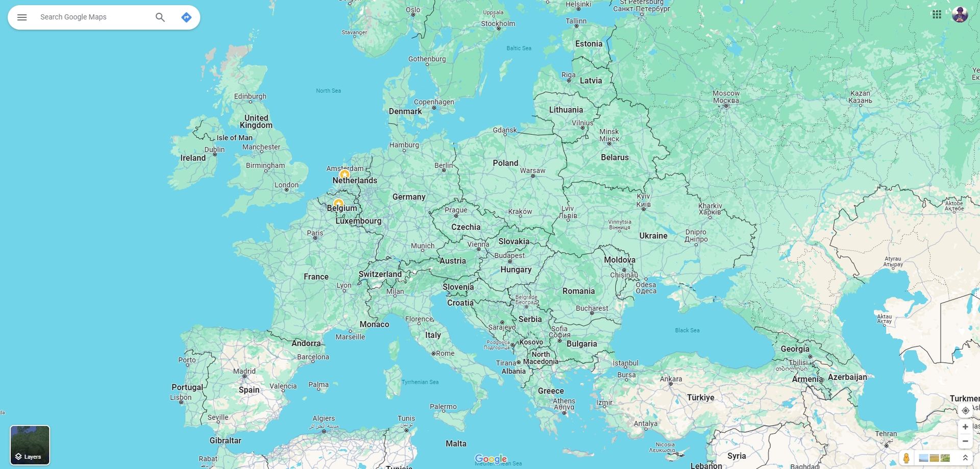
The Google Maps color change move by the tech giant might be the biggest mistake it has made recently. Most people hate it, but they are not very wrong about this, and many took the matter to social media. Currently, you can’t go bac to the old colors that everyone was familiar with.
Google Maps has recently given itself a fresh coat of paint, and users aren’t exactly thrilled about it. Though the changes aren’t earth-shattering, they’ve left many users feeling a bit puzzled and, frankly, not too pleased.
Unveiled officially by Google back in October, the updated color scheme has recently caught the attention of users, sparking debates on platforms like Reddit and Twitter. Roads, once plain and white, have traded their clean look for a somewhat muted gray. The serene blue representing water bodies is now more subdued, and wooded areas have taken on a darker shade of green. Adding to the mix, the route indicator has been dialed up in intensity, donning a brighter and more vivid shade of blue. For those who’ve grown accustomed to the old Google Maps aesthetics, these changes are raising eyebrows.

Google Maps color change causes social media backlash
As expected, social media has become a sounding board for disgruntled users. Reddit and Twitter are buzzing with critiques of Google Maps color change move. Some argue that the new bright colors lack the necessary contrast, making the map harder to decipher, while others have found some merit in the update. The online discourse is lively, especially on X, formerly known as Twitter, where opinions clash in a digital arena.
Google Maps vs Apple Maps: Which one is a better co-pilot?
This outcry hasn’t escaped the notice of tech enthusiasts and Google Maps fans who’ve taken to platforms like 9to5Google, sharing side-by-side visuals comparing the old and new color schemes. The differences are stark, adding fuel to the ongoing conversation about how these changes impact the user experience.

Mixed Feelings Amid New Features
Despite the color controversy, Google Maps has more to offer in this update. Alongside the palette shake-up, the tech giant has thrown in some extra features to sweeten the deal. Information on electric vehicle charging stations, a more refined search system, and the intriguing “Immersive View for Routes” feature in select cities are part of the package. The latter offers a multi-dimensional view of the route superimposed on satellite imagery, adding an extra layer of detail to your navigation experience.
Google Maps’ deadly error heads to court
Unfortunately, for those not vibing with the new colors, there’s currently no straightforward way to revert to the old color scheme. However, this doesn’t mean it’s set in stone, and Google’s track record of heeding user feedback suggests that adjustments could be in the pipeline.
In the grand scheme of things, while the color makeover has divided users, Google Maps remains a dynamic tool, continuously evolving to keep up with the ever-changing tech landscape. As online discussions about color preferences unfold, it’s essential to remember that change, even in the digital realm, is par for the course and can sometimes open doors to unexpected improvements.
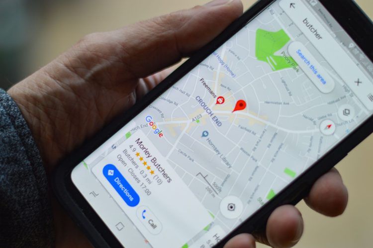
Featured image credit: henry perks/Unsplash


