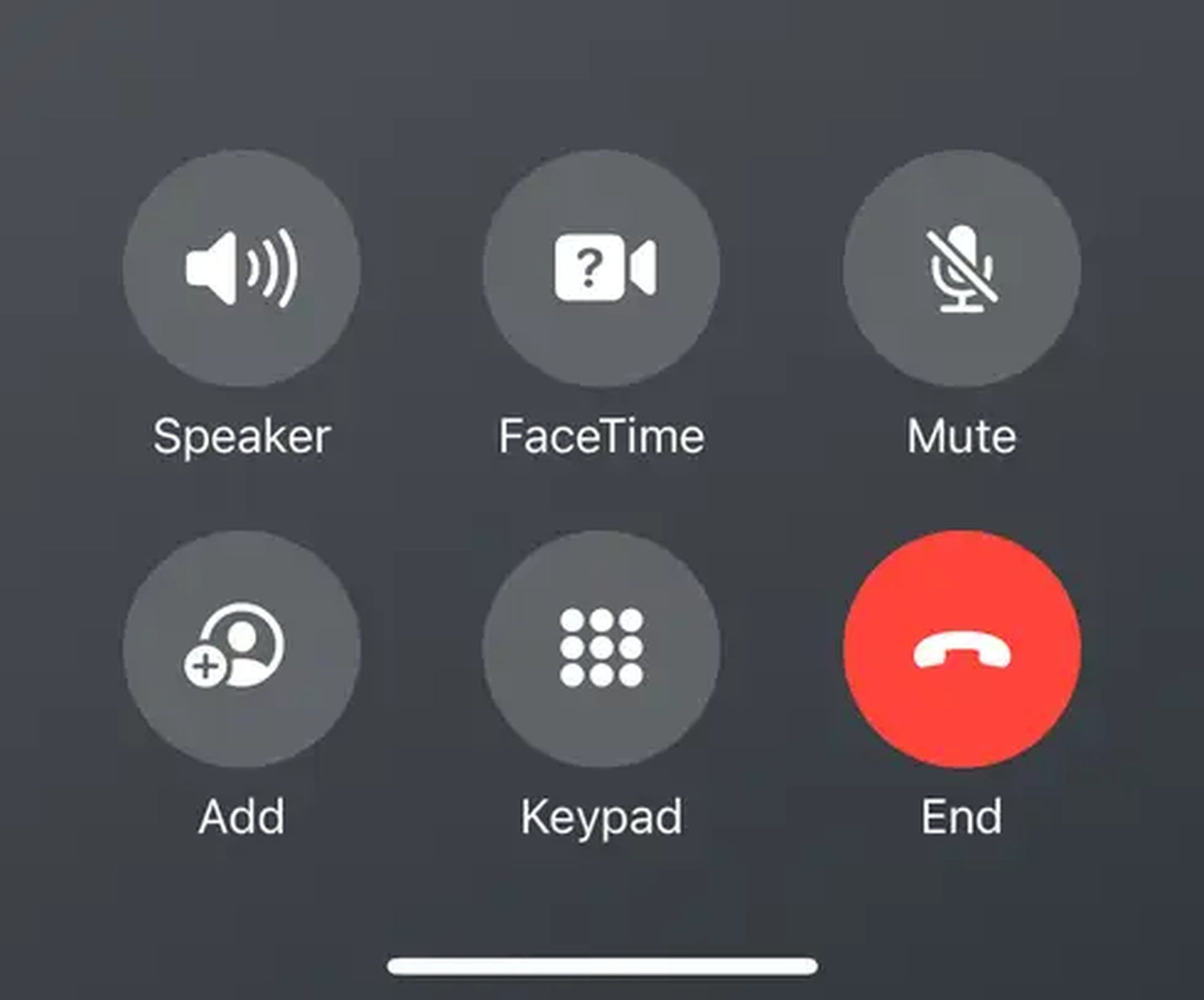
In a quiet yet impactful move, Apple has once again left its mark on the digital landscape with a subtle alteration that is sure to spark a flurry of discussions among its vast user base. The tech giant, renowned for its innovative design philosophy and user-centric approach, has discreetly relocated the end call button on the iPhone in the latest iOS 17 beta release.
The once-familiar placement has given way to a fresh perspective, now residing in the bottom left corner of the screen. This seemingly minor modification, while it may appear trivial at first glance, could hold the key to a more ergonomic and intuitive user experience, redefining how we interact with our beloved iPhones.

As with any alteration to a well-established user interface, Apple’s decision to relocate the end call button is poised to trigger a symphony of opinions and reactions. A user’s connection with their device often transcends the realm of mere functionality, intertwining with familiarity and comfort. Some might embrace the shift with open arms, lauding the newfound ease of access that this alteration brings to the table. With the button now within effortless reach of the thumb, ending a call becomes a seamless and ergonomic motion, potentially reshaping the way we engage with our devices during our daily routines.
However, change, even in its most well-intentioned form, rarely escapes the spectrum of diverse perspectives. The displaced end call button may evoke a sense of nostalgia among those who’ve grown accustomed to its original home in the upper echelons of the screen. The previous positioning, a fixture of countless interactions, may have etched itself into muscle memory, leaving some users to navigate a brief adjustment period. The intuitive nature of the former layout, a staple of Apple’s design ethos, could become a point of contention for those yearning for a sense of continuity in their digital interactions.
iPhone end call button’s position change: Details
Apple has quietly changed the location of the end call button on the iPhone in the latest iOS 17 beta. The button has been moved from the top left corner of the screen to the bottom left corner. This change is likely to be met with mixed reactions from users. Some people may prefer the new location, as it is easier to reach with their thumb. Others may prefer the old location, as it was more intuitive.
The reason for the change is not clear. It is possible that Apple simply wanted to make the button easier to reach. It is also possible that Apple is planning to add new features to the end call button in the future, and the new location will make it easier to implement those features.
Only time will tell what new features Apple has planned for the end call button. However, the change to the location of the end call button suggests that Apple is at least considering new ways to use this button.
Featured image credit: Taylor Grote/Unsplash


