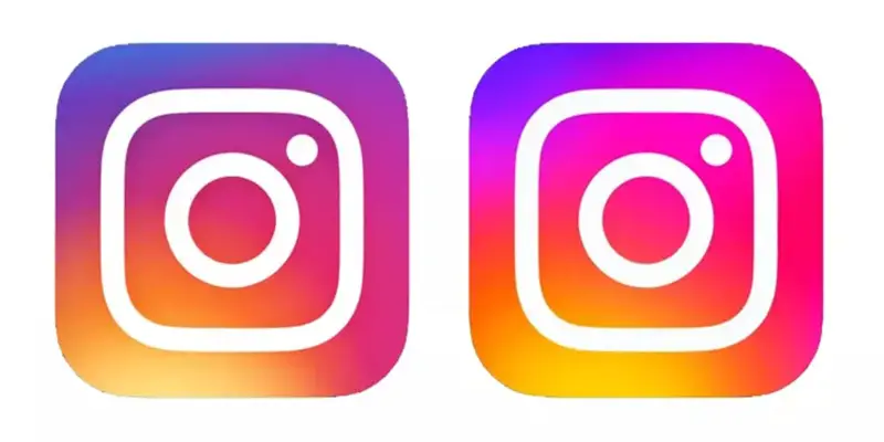
We gathered the new Instagram logo, font, and more in this article. Users on Instagram noticed last week that the app icon had become considerably more obvious. We now know why – it’s all part of Instagram’s biggest rebrand in years. However, the net is divided over Instagram’s new design.
Instagram has updated its logo and typeface, using a brand new custom typeface and the existing brighter emblem. The most noticeable difference is the new wordmark, which is now displayed in Instagram Sans.

New Instagram logo, font, and more
Instagram has announced a visual update to its platform. The refresh will allow the company to “deliver more immersive and inclusive experiences.” The rebrand, according to Instagram, is focused on three key areas:
-The gradient is reimagined with “vibrant colours to make it feel illuminated and alive, and to signal moments of discovery”.
-The new typeface, Instagram Sans, is “designed with Instagram’s heritage in mind and includes multiple global scripts.”
-The new layout and design system is “content-forward and celebrates creativity, simplicity and self-expression.”
Do you know how to change your profile name in Facebook?
Instagram’s new font design

We’ve already seen the new logo (designed by Rose Pilkington), which appears to be blinding some people. But now we’ve been given a much more in-depth look at the refreshed brand identity. Instagram Sans is a pleasant new typeface that’s been created in imitation of the Instagram logo’s squircle, which they call “lovingly” the “squircle.” In Stories and Reels, it may also be used.
The new icon has been out for a few days, and people’s reactions to it are flooding in. “I’m going to have to reduce my screen brightness for that,” one Twitter user complains, while another adds, “New Instagram icon is way over-saturated. Gross.” Users have also posted video recordings of iOS seeming to struggle with the new icon – when shutting down the program, the symbol appears to shimmy between the old and new designs.


