Volvo changes its logo for the era of the sustainable electric car. We are living through one of the most revolutionary periods in the history of the automobile sector. The top manufacturers have been producing combustion vehicles for decades, and they are changing course to embrace electric mobility.
Volvo is one of the most committed to sustainability, and the Swedish firm has wanted to commemorate this transition with the introduction of a new logo that is more basic and minimalist.
A new era at Volvo with a new logo
Changing the logo is not a minor operation, although it may seem so. A global brand abandons a recognizable image with which its products and its trajectory are related to launch a new one that must be recognizable and at the same time reflect new purposes.

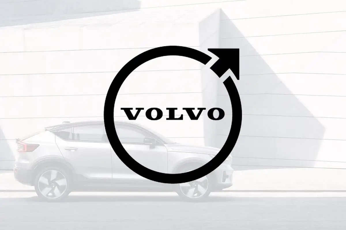
Volvo has faced this change, as have Dacia, Volkswagen and BMW recently. The result we have just learned through the social networks of the Swedish brand and the staging could not be simpler and cleaner: black on white background, the brand name surrounded by a circle, and the traditional arrow.

Volvo has not made any statement about it, nor have they explained what this change is based on, nor the meaning. What is clear is that this new two-dimensional logo represents a new phase for a company that must be equally recognizable.
Volvo has been immersed for years in a transformation process where they have proposed that all their cars will be electric by 2030, but apart from clean mobility, they are also striving to be a sustainable brand, without leather, with sustainable and recycled materials.

With this, added to the changes in design and launching products designed for a wider audience, the change of logo was only a matter of time. Simplicity and sophistication with the same essence.


