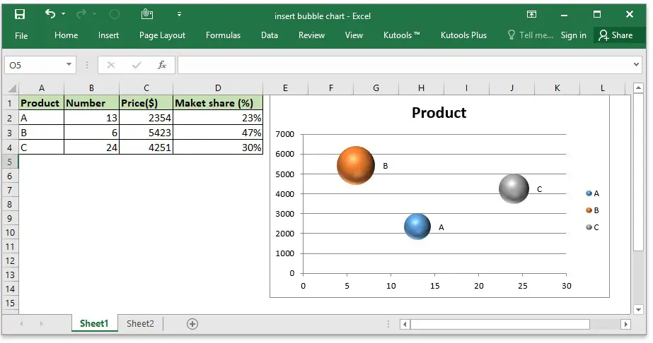
If you don’t know how to create a bubble chart in Excel, you will find the answers in this tutorial. Creating a bubble chart in Excel can be a tricky task if you are not an expert in this software.
Bubble charts in Excel help us to see three variables in a single chart. One for the x-axis (the horizontal), another for the y-axis (the vertical), and a third for the size of the bubble.
How to create a bubble chart in Excel?
As always, we must place the information as comfortably as possible in order to create our chart quickly. Let’s say you will create a table of countries with data included such as the number of inhabitants, the size and the oil consumption.
- The information could be complex to analyze at a glance, so we will rely on a bubble chart.
- First of all, we will select part of the data table.
- Then we will go to:
- Insert tab >> Charts group >> Scatter charts >> Bubble chart.
- We will select the chart that is shaded in light green. The graph will appear in our Excel sheet.
- Effectively, we already have the bubble chart but now the trick is to add the labels corresponding to each country.

To insert the labels for each country we must first insert the labels in general, regardless of the data that appears. So, select the chart and right-click on any of the bubbles. In this menu, we select the “Add data labels” option, and numerical labels will appear on the chart.
Once we have the data labels we will have to modify them one by one, that’s why I don’t recommend that you use many bubbles in these charts or you will go crazy.
To modify the bubble chart labels double click on one of the labels to select its content. Then, a drop-down menu will appear.
Then, we can manually change the label of each of the bubbles by typing the name of the country we want or we can select the “Cell” option from the dropdown menu.
As you can see, it is not a very complicated process. This way you’ve learned how to create a bubble chart in Excel. Why don’t you try it out now?


