During today’s Windows 11 event, Microsoft did not mention anything about File Explorer, one of the most used apps on the Windows platform.
New Windows 11 File Explorer features
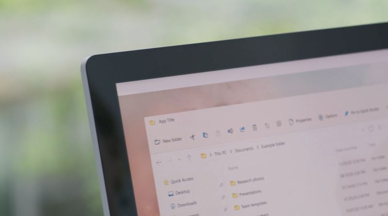
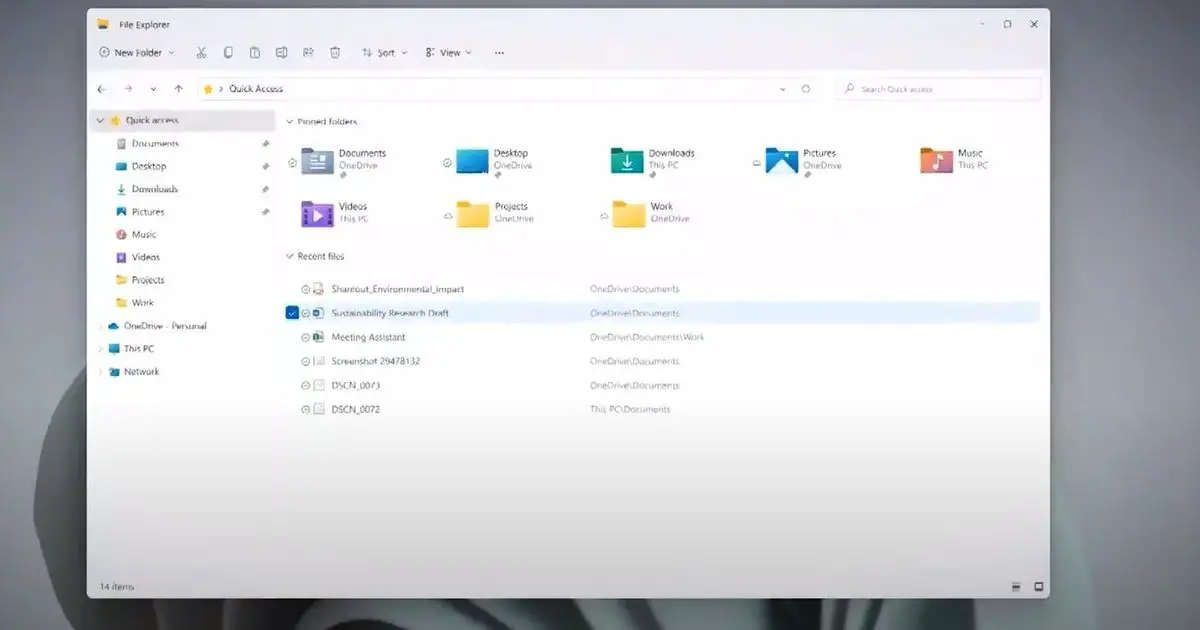
However, Microsoft has offered us a glimpse of the new File Explorer coming in Windows 11 through a new video uploaded to YouTube dubbed “See how Windows 11 has been designed”.
As you can see in the video, Microsoft has replaced the user interface in File Explorer with a new simplified menu instead of the classic ribbon interface with quick actions that we have now and that was debuted in Windows 8. The new menu would come with smaller Fluent Design icons. From the looks of it, it’s a big redesign, but nothing.
Compatible with the touch version

In addition, the new simplified menu is compatible with the new touch mode, in general, much improved in the new version of the operating system. The new interface will be more suitable for touch uses, but the tabs are still the eternal omission.
The new Windows 11 file explorer interface could come with a redesign of Office, another of Microsoft’s star programs that were also not mentioned in today’s intense meeting. It should be remembered that the Redmond firm is testing a version of its office suite with dynamic modules and a new design.
The designers have not explained in the video what other changes will arrive for the file explorer. Next week, Microsoft will release the first build of Windows 11 Preview for Insiders. Nothing is confirmed but there is a chance that this new Windows File Explorer app will come in this preview build.


