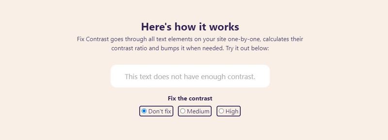
Today we will tell you how to increase the contrast of web pages to make them more readable. Many web pages use pastel colors on soft backgrounds that can be very pleasant for many people, although the lack of strong contrasts can make the experience terrible for those who have some vision problem.
How to increase the contrast of web pages to make them more readable?
Contrasts help to identify text on backgrounds, and although forcing them can spoil part of the visual effect you wanted to define when creating the page, it can help to make it more readable, which, after all, is the goal of disseminating content.
Browsers do not have this native resource, there is no way to press the right button and adjust the contrast of the page we are visiting. Some monitors can do it, but the result is usually quite questionable, as each web page may respond to those adjustments in a different way.
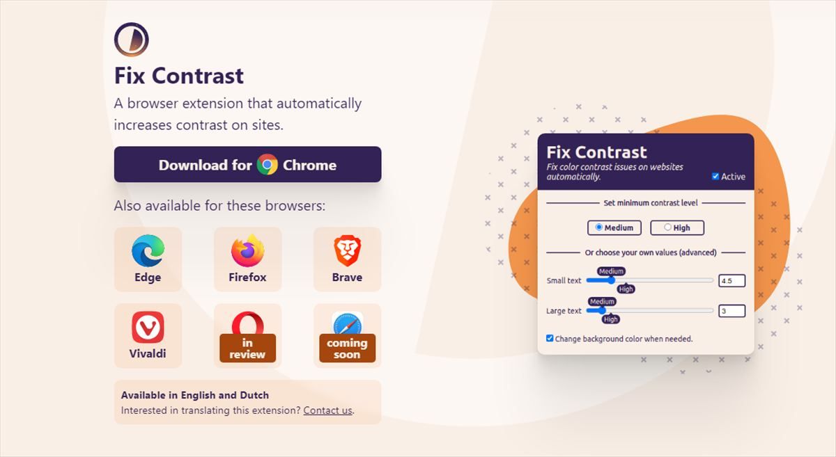
What I present to you today is a solution that can be applied in Chrome, Edge, Firefox, Brave, and Vivaldi, a plugin that we can install for free to bring up the control that you can see in the screenshot above, a panel to better manage and control the contrasts of what we are viewing.

They present it like this:
Low contrast text is the most common accessibility problem and affects 86.4% of pages. This free extension based on technology developed for Polypane (https://polypane.app) automatically corrects contrast problems on any site you visit.
The algorithm responsible finds contrast problems and automatically suggests the closest color with sufficient contrast. It is an existing resource for those who create sites with Polypane, and they have used the same code to create a free plugin that can help a lot of people.
The best thing is that it can make the adjustments automatically, although we can also customize it by even asking it to put a black background behind each text to improve readability.
You can install it from fix11y.com.


