Netflix is implementing some visual changes in the profiles for children to make them more enjoyable for the little ones at home.
These changes are already being implemented on all Netflix accounts, although they will not be available on mobile devices yet.
New design for children’s profiles on Netflix
We are already used to seeing rows and rows of recommendations every time we log in to our Netflix account. And of course, so are Netflix premieres promoting themselves over and over again. But this dynamic doesn’t work to catch the attention of the little ones, and that’s why Netflix is betting on a more visual design, as seen in the new update.
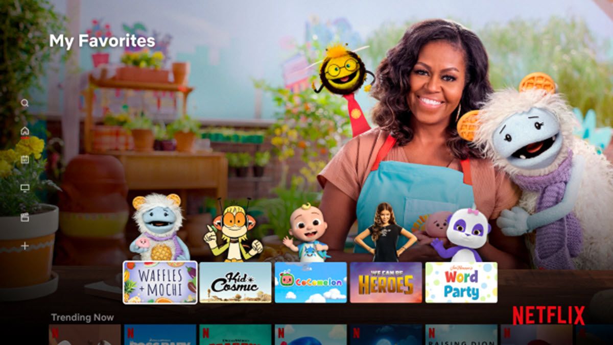
Instead of so many suggestions and related programs, Netflix will show kids their favorite content and characters along with a matching background when they enter their profile. Yes, as soon as they open the profile they will find all the content that is familiar to them with a selection of characters based on the shows chosen.

So even the little ones will be able to quickly find their favorite cartoons or movies without having to scroll through the suggestions or ask their parents for help. Of course, all this content that gains priority in the profiles of the little ones will change according to their preferences and playback history.
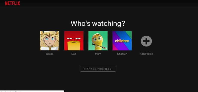
One detail to keep in mind is that this new design is only being implemented in Netflix profiles on TV, but it may be extended to mobile devices in the coming months. Recall that to create a kids profile on Netflix, you just need to choose “Create profile” and then enable “kids only”. You will see that a logo (kids) is automatically added to the profile icon so that it can be identified from the rest of the profiles and all the corresponding changes and controls are applied.


