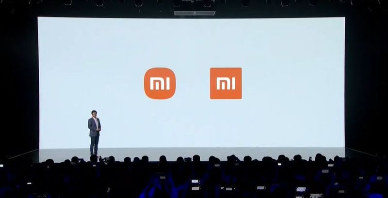
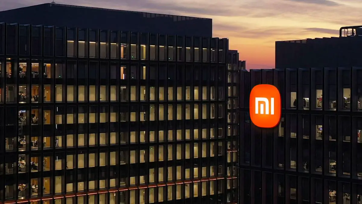
In a big presentation of Xiaomi’s new hardware products, the Chinese company has given a surprise by announcing the change of its corporate visual identity, after 10 years of using the same design.
Xiaomi’s new identity seeks to reinforce its positioning in the high-end market. The new brand image has been presented under the name “Alive”, with the dual objective of reinforcing Xiaomi’s positioning in the high-end market and increasing brand awareness among target audiences, through a new and dynamic logo designed by the Japanese Kenya Hara.
The term “Alive”, which seeks to encompass the philosophy of the Chinese technology company from a visual perspective, has been chosen because “technology is created by people, who in turn are alive, so technology is alive,” Xiaomi explained in a statement.
The dynamic balance between a square and a circle
For the renovation process, designer Kenia Hara has used the mathematical formula known as “Superellipse”-adjusting some parameters-, to achieve a visually optimal dynamic balance between a square and a circle. “The new logo features a more agile shape, which perfectly represents Xiaomi’s flexibility, relentless character, and willingness to move forward,” the company says.

The new design adopts a softer and rounded outline in the corners, along with the typography of “MI” also redesigned. Of course, Xiaomi maintains orange as the corporate color, although they also announce that they will use black and silver as complementary colors to accommodate the applications of the high-end product line.
Another new feature of the new brand identity is that the logo is not fixed to the corners of the square, but adapts to the content, and can be placed in the most appropriate position.


