The first Android 12 Developer Preview should arrive sometime this February, and Google has already begun to prepare the ground. After several leaks through the AOSP code, we now have the biggest leak so far: The radical change in the interface that would arrive with Android 12.
Android 12 radical design change has leaked
According to an alleged official Google document, several of the features that could arrive with Android 12 are detailed.
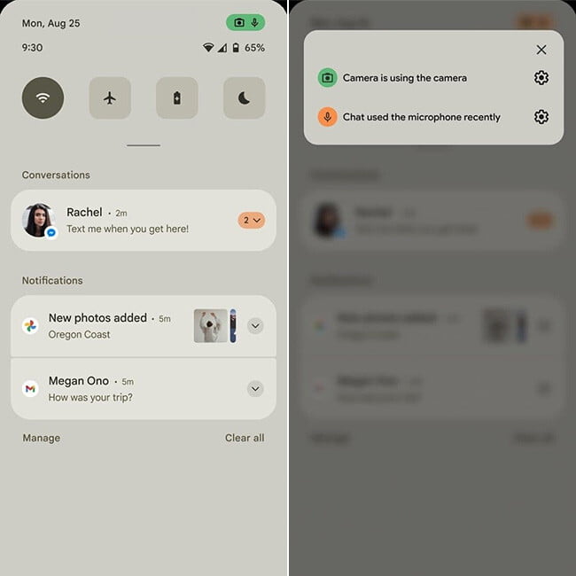
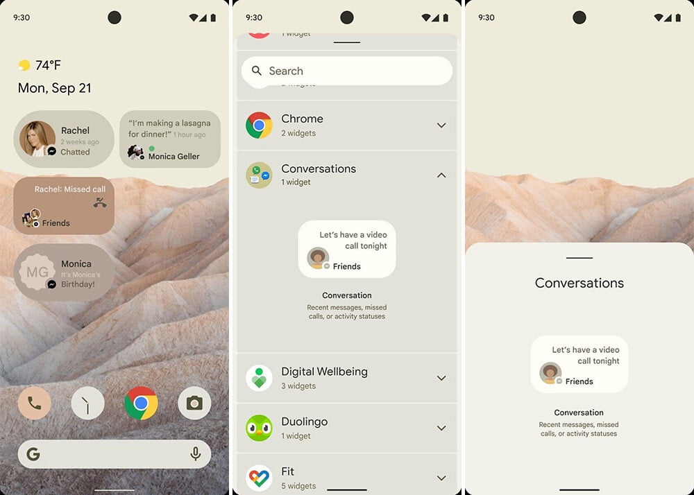
In the screenshots of the document obtained by XDA, we have detailed views of what could be a good part of the Android 12 interface. It should be emphasized that it is unclear whether these are sketches or actual screenshots.
Beyond the muted color tones and with a predominance of brown that, according to a previous leak, could be more customizable than in previous versions, we have a design with larger elements and with more spacing between them, alternating between circular and square elements with rounded edges.
For example, the notifications panel shows four quick settings, the active one with a circular design and the rest in the shape of a square. Below, the notifications panel maintains the separations in categories between conversations and the rest, although with the novelty of including privacy indications, both in the notification of a chat app and in the status bar.

Google liked the privacy indicators in iOS 14, and apparently, it will include something similar in Android 12. Not only will you see which apps use the camera or microphone, but tapping on this indicator will allow you to access options to disable the camera, microphone, or location with a tap.
Widget for conversations
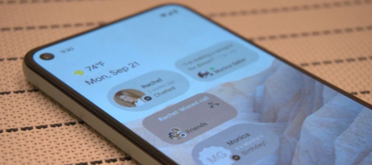
On the home screen, we don’t see many changes from previous versions, with a dock with four icons and the use of the same color scheme as the other screenshots. The most relevant is the conversations widget, which could bring together in a widget everything that has happened in all the applications you have installed on your mobile.
For example, in the screenshot, we see indications of contacts, chats, and missed calls in Messenger. All the widgets shown in the example are from Messenger, although it would be expected to work for all apps that use the Conversations API introduced in Android 11.

Once again, we have widgets with an oval shape and very pronounced curves and others that are rather square with rounded shapes. A bit messy in our opinion, although we will have to see if this is the final look or not.
We’ll have to see how it turns out. The color theme used in the screenshots is a bit peculiar to be included by default for all users, so it is most likely just an example of what can be achieved with the -alleged- system of themes that would also be included in Android 12.


