These are the 3 apps with the best design according to Google. The company has organized a new delivery of the Material Design Awards and has awarded three applications for the design of its interface.
December is the time to look back and select lists with the best of the year. These months we have already seen lists with the best applications of the year, something that Google itself has done in the Play Store, but also Huawei too does in its AppGallery. Today we show you the applications with the best design.
These are the 3 apps with the best design according to Google
Since 2015, Google has been organizing the Material Design Awards, where the applications with the best design are awarded. The sixth edition of these awards has already taken place and leaves us with three winning applications. On this occasion, the firm seeks to reward the ingenuity and creativity of the interface of these apps.
Winner of Material Theming: Moooi.com
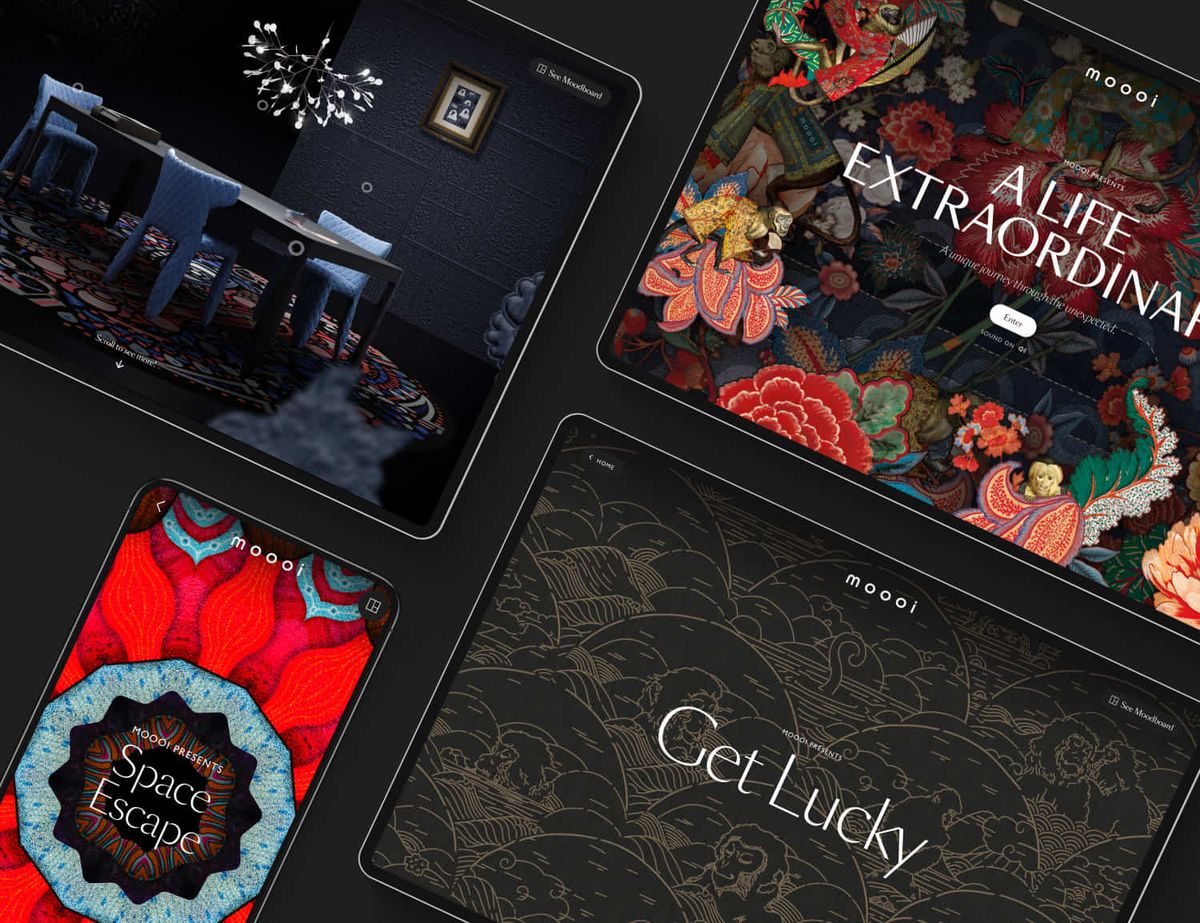
The first winner for Google is Moooi (which comes from “Mooi” meaning pretty or beautiful in Dutch), which is the winner in the category of best Material Theming interface. This furniture and lighting supplier has managed to attract attention for its interface, the result of the great innovation work of the team behind it.

This interface has managed to combine a great immersive experience thanks to its use of animations and transitions, which makes it visually very interesting. Furthermore, they have never forgotten about accessibility, so it is easy to use and it is easy to move around in it, being even possible to move around using voice.
Winner of Material Motion: Epsy
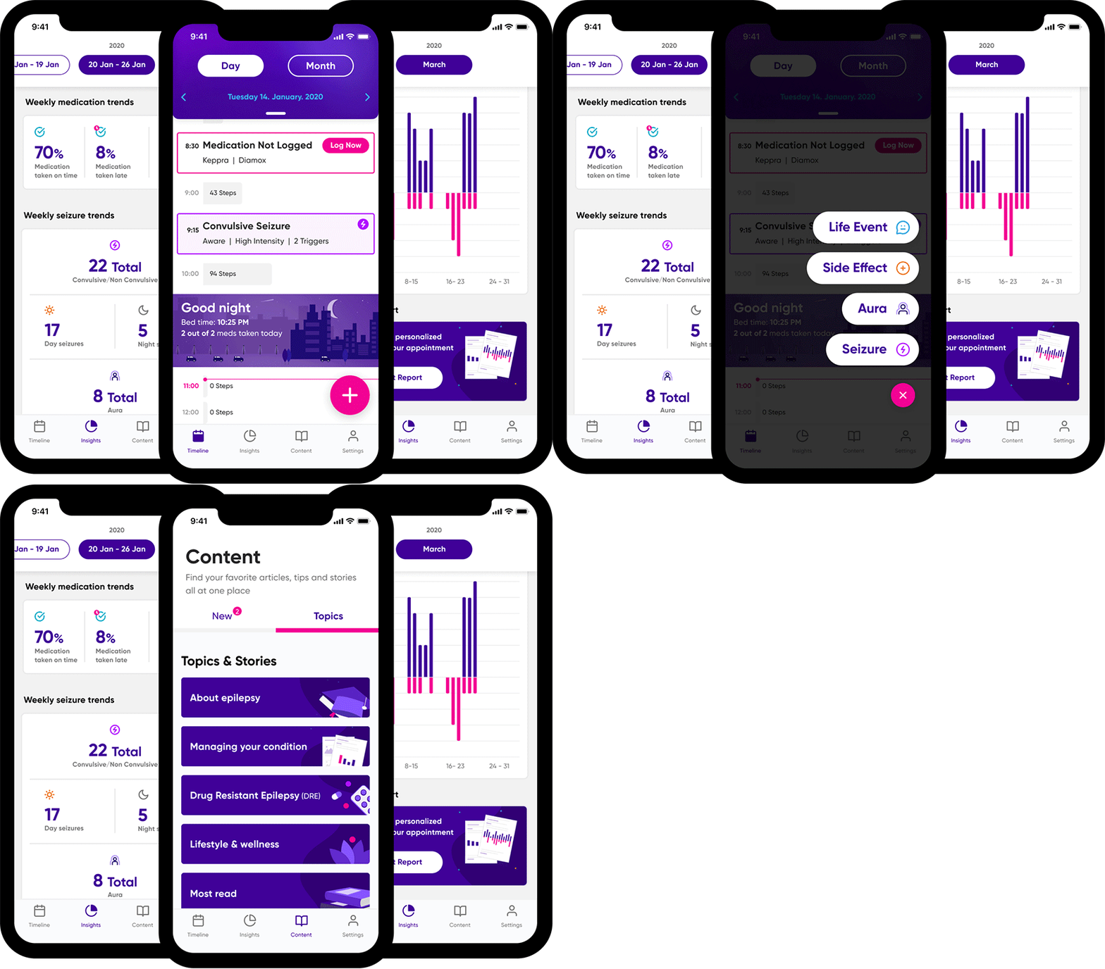
In second place we have the award for best design Material Motion. Google has crowned Epsy as the winner, a medical application for people with epilepsy. This application is intended to improve the quality of life of people suffering from epilepsy.

The movement of the interface in the app is used to guide users through critical tasks with which to improve their quality of life (taking medication, connecting with other people…). Animations are used with longer times, which seek to convey tranquility to users. This contributes to a positive user experience.
Winner of Dark Theme: Kayak
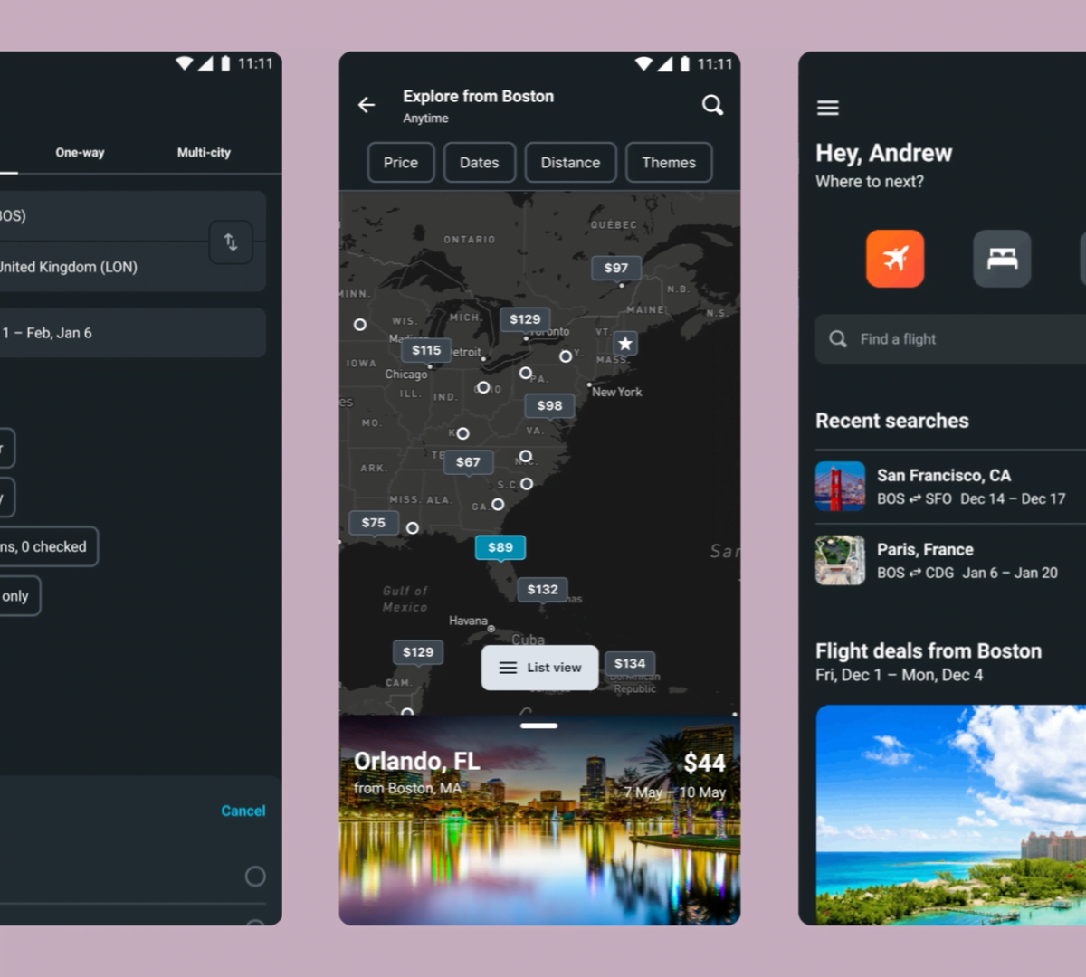
Kayak is a popular travel application, which is the third winner in these Google Material Design Awards. The app wins the Dark Theme award. The dark theme created by those responsible for the application has been valued, having achieved a balance that is not always simple.

Its designers have been able to create a dark theme that transforms the interface, the background, into a dark color. But at the same time, it works in harmony with the colors of the brand, so that it remains recognizable at all times, which is another of the most important aspects of this dark mode.


