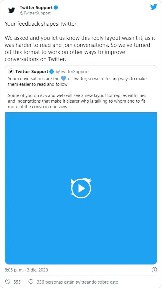
Twitter decided to halt its works on a conversations view with threaded tweets that it worked on for a while.
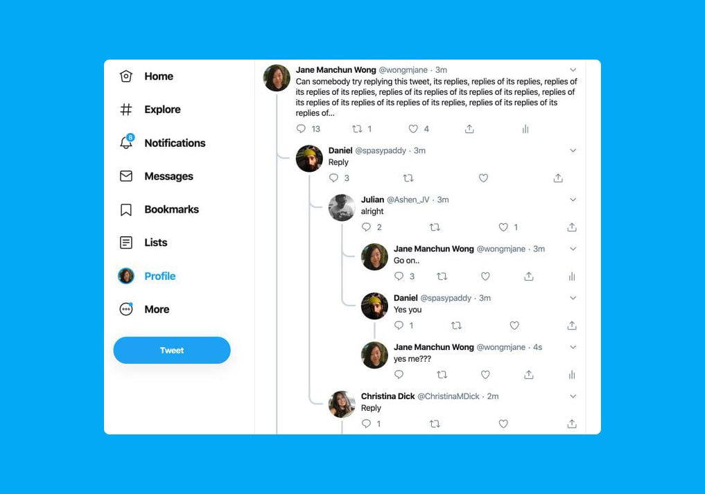
For more than a year, Twitter has been testing a new view for the platform’s conversations that resembled the usual view on Reddit. Until now, it showed replies to each tweet as part of a new tree view. This format says goodbye, “for now”.
The company began testing this concept in its experimental Twitter application on iOS, known as Twttr, and later brought it to the web client. The idea was that the platform’s conversations would be easier to follow, given the increase in threads and responses. The feature did not make it to last year’s redesign.
Users felt that following the nested responses made it more difficult to follow the threads.
This is what the threaded tweets looked like in the experimental version of Twitter for iOS.

Twitter claims that they asked users, and they conveyed that the new format was more difficult to read and made it harder to follow conversations. In other words, the opposite of what was intended when the test was launched.
The interface design at that level is not simple, and it is true that there are better implementations in the visual section than the one Twitter proposed, but much of the blame for something like this not working for millions of people lies in the fact that it is not the most common in social networks.
Generally, the public is used to seeing answers from others in a more classic way, as for example occurs on YouTube, where the answers are shown in a submenu and by default are hidden. Twitter tried to give more visibility to the conversations in tweets with threaded approach, but in the search for them, users would get lost.


