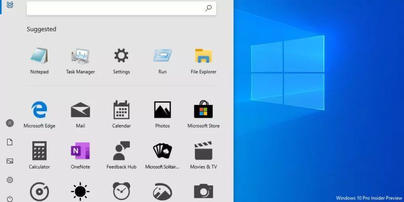
Microsoft has been working on the new design of the iconic Start menu of Windows 10 for a while. A video that appeared on Twitter gave clear insights into Microsoft’s new design.
In the short video shared by the Microsoft Design account, it has been stated how the start menu has improved over the years since Microsoft Windows 95.
Created by the @Windows design team, this animated clip illustrates a sliver of the #UX evolution and modernization of the Windows experience. Let us know what you think in the comments below! pic.twitter.com/s4SVXncLEo
— Microsoft Design (@MicrosoftDesign) April 6, 2020
The company also asked Twitter users for their thoughts on the new design, and the feedback so far seems mostly positive.
New Windows 10 Start menu features
The new start menu offers a more compact look than the current version. The icons in the new start menu carry Microsoft’s new ‘fluent design’ concept. The more space used makes the management of the computer less confusing for those with a large number of installed applications.
Although it is rumored that Microsoft will completely remove, the icons on the menu resemble the Live Tiles, which was introduced with the Windows Mobile.
Another change that surprises those who browse the new design is that the texts are below the application icons and is not visible. This situation leads to the appearance of a clean and tidy appearance. However, it might be confusing for some if you don’t know with which icon belongs to which app. This move is perhaps the most controversial change made in the new start menu. For some people, the lack of app names means simplicity, while for others things will become more complicated.
It is not known when the new Windows start menu will appear before our eyes. Of course, there may be some changes in the final version. The next major Windows update will arrive on May 10, 2020. If the new design does not come with this update, we are going to wait for the next update.


